
Three reed diffuser fragrances do not automatically need three bottle structures, three box constructions or three completely separate packaging systems.
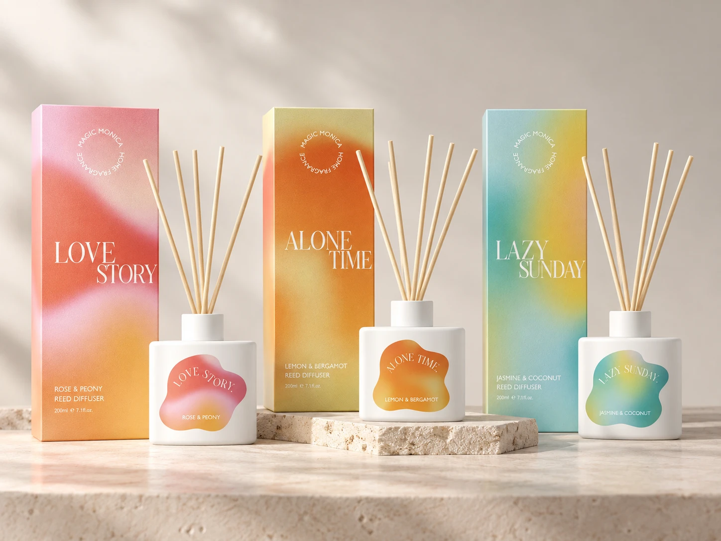
In this HIVEDA project, Love Story, Alone Time and Lazy Sunday all started from the same Ready Design white diffuser bottle. The product identities were created through SKU-specific labels and coordinated printed boxes, while the bottle shape and box structure remained shared across the collection.
That separation between structure and artwork was the key to the project. It gave the three fragrances enough visual difference to stand on their own without turning every SKU into a new packaging development.
Three Fragrances Did Not Need Three Bottle Designs
The bottle itself is intentionally simple: a white stock diffuser vessel used across all three SKUs.
That made the project a good fit for a Ready Design reed diffuser route. The existing bottle structure provided the common physical base, so the collection did not depend on developing a new bottle shape for every fragrance.
The visible variation was moved elsewhere.
Love Story uses a pink, coral and orange direction. Alone Time moves into orange and yellow. Lazy Sunday shifts toward blue, green and yellow. The bottle stays the same, but the first thing the customer sees changes with each fragrance.
For a multi-SKU launch, that is an important distinction. Product differentiation does not have to begin with structural differentiation.
The Label Became the SKU-Level Design Layer
The bottle labels do most of the SKU-level work.
Each white bottle carries an irregularly shaped gradient label with its own fragrance name and scent description. The shape of the label remains visually related across the collection, while the color palette changes from one fragrance to the next.
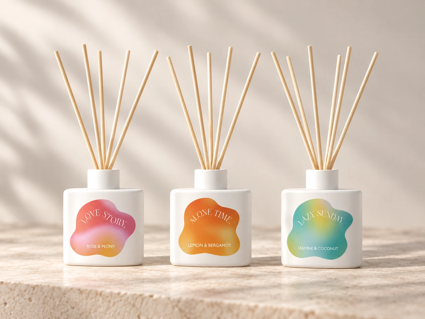
HIVEDA handled both the label design and label production. The client planned to apply the labels later as part of its own downstream operation.
That production boundary matters. This was not a project where every operation had to sit with one supplier. HIVEDA developed and supplied the packaging components needed for the visual system, while the client retained the later labeling and filling stages.
The Box Repeated the Fragrance Identity Without Changing the Structure
The outer cartons continue the same fragrance-specific color language.
Love Story moves through pink, red and warm orange. Alone Time uses a warmer orange and yellow palette. Lazy Sunday combines cooler blue and green with yellow. The large gradient fields give each box a distinct presence, while the typography and overall layout keep the collection recognizable as one brand system.

Crucially, those three boxes share the same dimensions, box construction and dieline. The variation is in the printed artwork, not in the packaging structure.
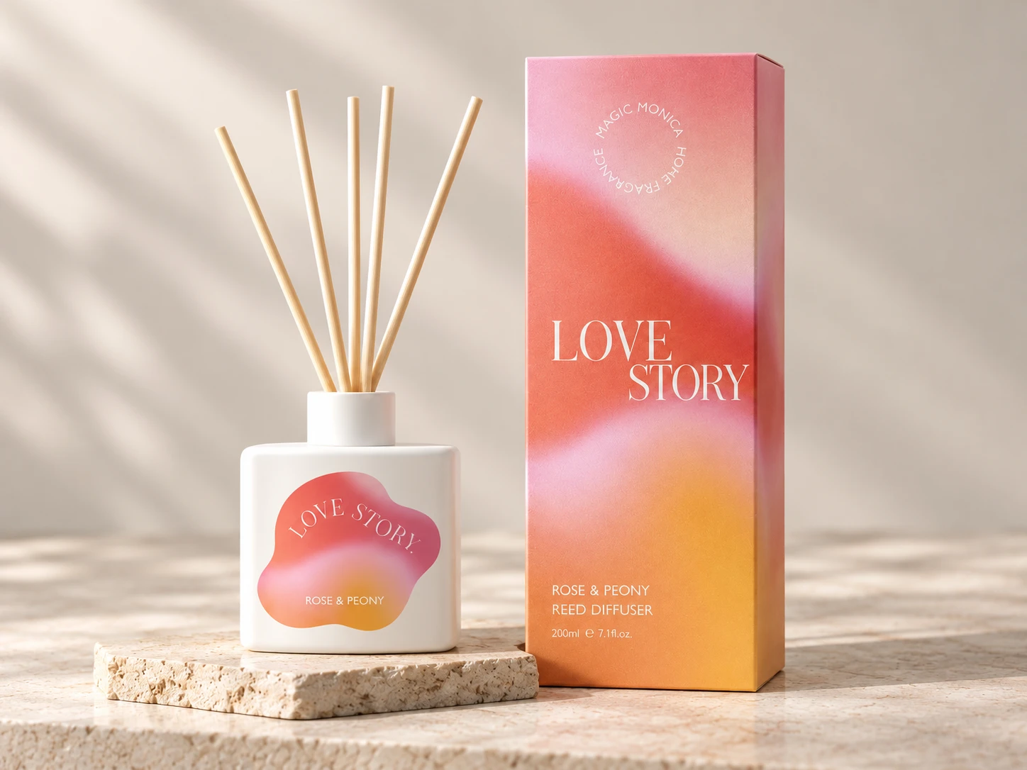
That relationship between the label and the carton is what gives the collection cohesion. The bottle does not need elaborate structural customization because the visual identity continues from the small label surface onto the much larger box.
Three Artworks Do Not Always Mean Three Separate Print Runs
This is where the project becomes more interesting from a production-planning perspective.
The three cartons use different artwork, but they share the same box structure and dieline. That allowed the printed versions to be arranged through a gang-run printing approach rather than treating every SKU as a completely unrelated packaging format.
In practical terms, multiple compatible artworks can be planned together within the same packaging production arrangement. The box still changes visually from one fragrance to another, but the structural setup does not need to be reinvented each time.
For this project, that helped keep the overall packaging MOQ under control while preserving three distinct fragrance identities.
The important point is not that different artwork automatically removes MOQ. It does not. The point is that the way those artworks are structured and produced can determine whether a three-SKU collection behaves like one coordinated packaging program or three unrelated packaging jobs.
MOQ Becomes Easier to Understand When You Separate Structure From Artwork
MOQ discussions become clearer when the project is broken into components instead of treated as one number.
In this collection, the main layers were:
- one shared stock diffuser bottle structure;
- three SKU-specific label artworks;
- one shared carton structure and dieline;
- three SKU-specific printed carton artworks.
Each layer can follow a different production logic. The bottle quantity may be combined across the collection. Labels are separated by artwork. Cartons share one physical format but carry different print files.
This is why buyers planning several reed diffuser fragrances should ask more than, “What is the MOQ?”
A better discussion separates the bottle MOQ, label quantities, packaging structure and printed artwork versions. That makes it much easier to see which differences are actually creating complexity.
This Project Stopped Before Filling — and That Was Intentional
HIVEDA’s confirmed scope for this project covered visual design, bottle and carton packaging development, label design, label production, and the supply of the bottle and printed box components.
The client planned to complete label application and fragrance filling independently.
That is worth stating because fragrance projects do not all need the same production model. Some buyers want a fully filled and assembled product. Others already have their own filling capability and need support further upstream with product design and packaging materials.
In this case, the handoff point was deliberate: HIVEDA developed the visual and packaging system, while the client retained the operations it intended to manage itself.
The result was a packaging platform that could move into the client’s own filling workflow without requiring three different bottle structures or three different carton constructions.
For Multi-SKU Diffusers, Decide What Really Needs to Change
The most useful question at the beginning of a multi-SKU reed diffuser project is not, “How can every fragrance be different?”
It is, “Which differences actually need to become physical components?”
A new fragrance identity may need its own name, color, label and box artwork. It does not automatically need another bottle mold, another bottle structure or another box dieline.
This three-SKU project kept the structural decisions shared and concentrated the variation in the parts customers actually see: the bottle label and outer-box artwork.
That gave Love Story, Alone Time and Lazy Sunday separate identities while keeping the packaging system controlled enough to support a lower overall MOQ objective.
Brands considering a similar collection can explore HIVEDA’s broader reed diffuser development options or discuss a multi-SKU packaging plan before deciding how much of the product really needs to change from one fragrance to the next.