
A perfume bottle can carry part of a brand’s identity through its shape, proportions and details. For NICHELIO, that was the reason to commission a private-mold bottle and cap: the client wanted to move away from the familiar appearance of standard packaging and develop a more recognizable product.
HIVEDA participated in the full chain of design and production, including fragrance development. The finished presentation brings together a clear bottle, a black faceted cap, gold-colored details and coordinated outer packaging.
Why NICHELIO Chose a Bespoke Bottle and Cap
NICHELIO wanted to move away from the sameness of widely available bottle shapes and establish a more recognizable product identity. That objective led to a fully bespoke route for both the perfume bottle and its cap, with HIVEDA involved in design and production across the project.
The decision brought the complete silhouette into the development brief. Bottle width, shoulder shape, the transition at the neck and the cap’s proportions could be considered together. Each contributes to how the product looks before the fragrance name is read.
This is a useful distinction for brands evaluating bespoke perfume bottle and packaging development. A private mold gives the project control over the component’s shape. The design still needs a clear purpose: which proportions or details should help a buyer recognize the brand?
For NICHELIO, the visible answer is restrained. Clear glass, a black faceted cap, a gold-colored neck detail and a white front panel create a compact set of recognizable elements.
Clear Glass Gives the Bottle Shape Room to Speak
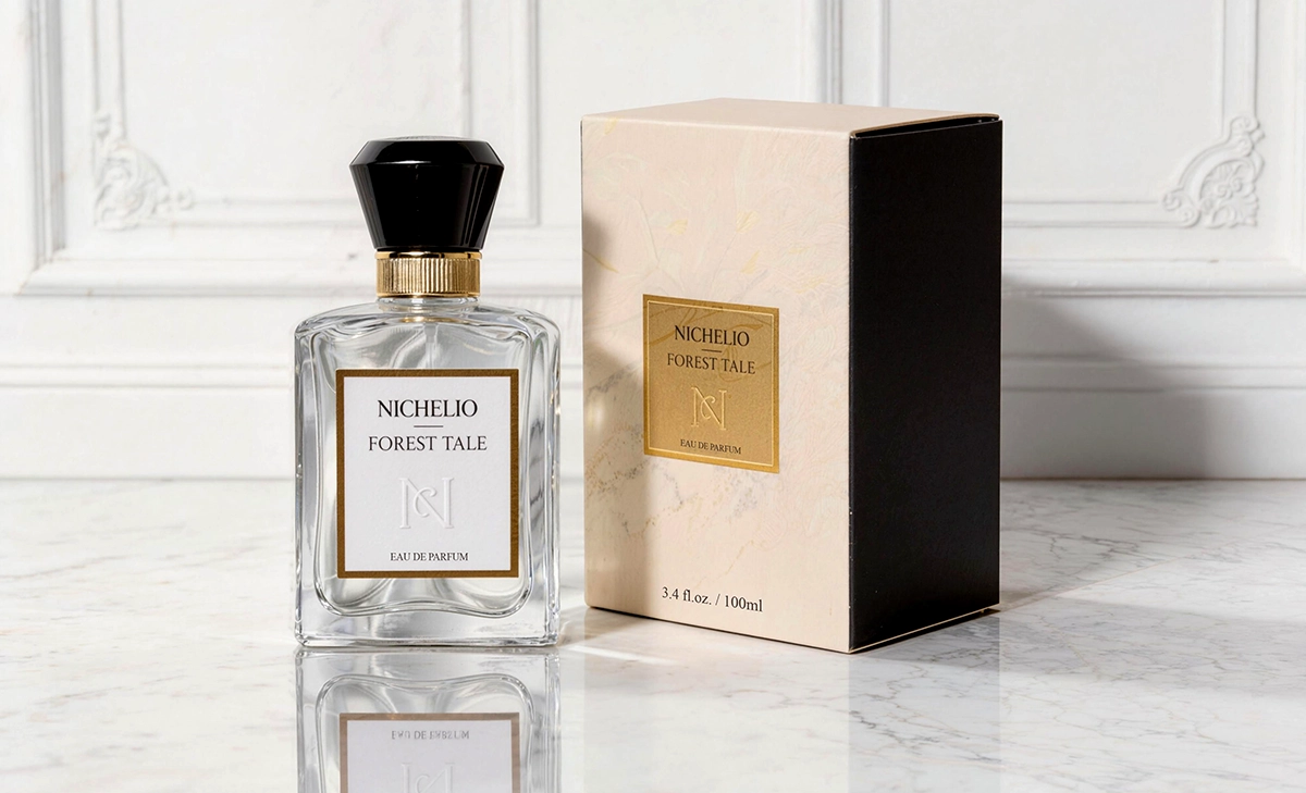
The bottle has an upright rectangular body with softened shoulders and a substantial-looking base. Light catches the outer edges, while curved reflections around the shoulders and lower body give the transparent form depth. The glass remains visible around the central label.
That open perimeter matters to the composition. The white front panel provides a calm surface for the NICHELIO name, fragrance name and monogram. Its gold border establishes a smaller rectangle within the larger bottle, giving the eye a clear route from the overall shape to the printed information.
The clear presentation also lets the bottle and cap carry different visual weights. The body reads through edges and reflections; the black cap reads as a solid shape. Together, they make the upper and lower parts of the packaging easy to distinguish.
For another brand considering custom glass, the front artwork deserves attention alongside the bottle drawing. Its size and position determine how much of the new shape remains visible. Here, the panel leaves room for the shoulders, side edges and base to remain part of the design.
The Black Cap and Gold Detail Define the Upper Silhouette
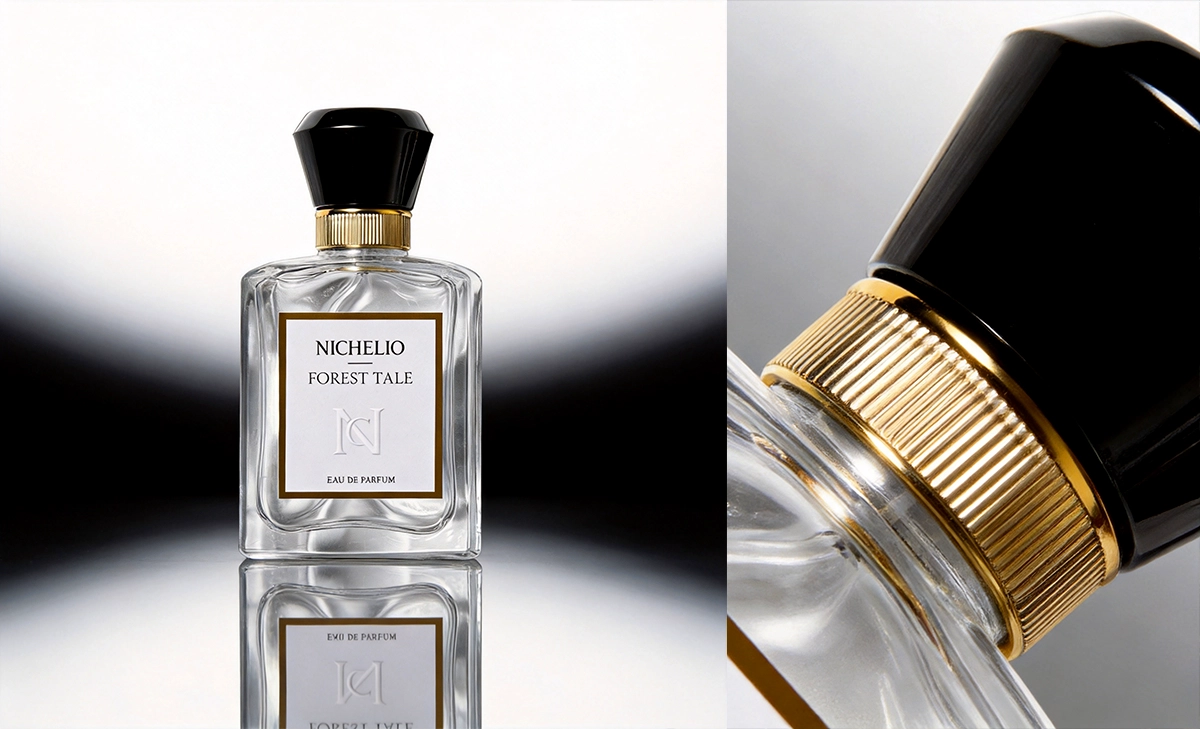
The black cap widens toward the top and narrows toward the neck. Its angled faces catch narrow highlights, giving a compact form more definition than a flat black surface would provide. The softened top prevents the outline from appearing overly sharp.
Beneath it, the gold-colored vertical ridges introduce a different scale of detail. The cap is read as a broad shape, while the ridged section is read as a finer band. That change in scale creates a distinct transition between the dark cap and transparent bottle.
The gold border on the front panel repeats the neck detail’s color. This gives the small band a connection to the rest of the bottle, rather than leaving it as an isolated decorative accent.
Both the bottle and cap were developed using private molds. The close-up is useful for understanding why the pairing matters: the top of the bottle is defined by the cap’s width, the narrower neck and the space between the shoulders and cap. A similar project should review that complete outline, as well as each component individually.
The Box Extends the Bottle’s Visual Language
The Forest Tale presentation shows the bottle beside an outer box with a light patterned face, a dark side panel and a gold front panel. Those surfaces repeat the light, dark and gold contrasts already visible on the bottle.
The color roles shift across the two objects. On the bottle, white occupies the central panel and gold forms its border. On the box, gold fills the central panel against a pale background. The recurring brand name and monogram make the relationship clear even though the layouts are not identical.
The box also provides a larger area for the delicate background pattern. The bottle’s clear body remains comparatively open. Seen together, the two pieces distribute the visual detail across the presentation without crowding the front of the perfume bottle.
For a buyer commissioning a full packaging set, this is worth reviewing in one view. Bottle and box should be assessed side by side: the balance of light and dark, the relative size of the brand panels and the placement of the repeated color all affect how the set reads.
Fragrance Development Was Part of HIVEDA’s Scope
HIVEDA also participated in developing the fragrance. Its involvement covered design and production across the project, bringing the scent into the scope alongside the private-mold bottle, private-mold cap and packaging.
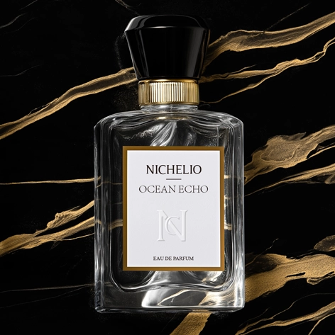
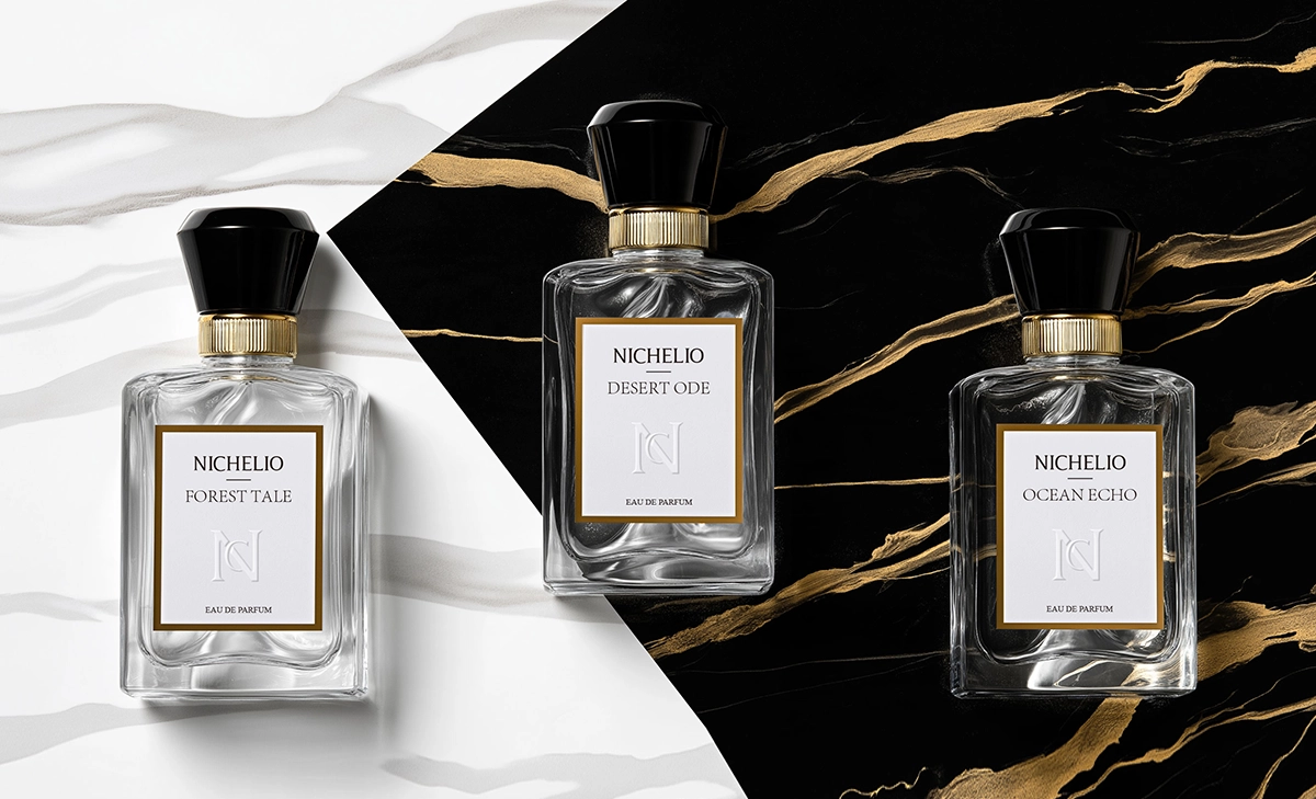
The project images show the names Forest Tale, Desert Ode and Ocean Echo within the same visible packaging language. The name changes on the front panel, while the bottle presentation, black cap and gold details remain visually related across the examples shown.
For a brand planning a similar project, the scope of fragrance work deserves its own place in the brief. The desired scent direction and the responsibilities for developing it need to be clear alongside the packaging requirements. A bottle drawing alone cannot communicate that part of the product.
This project illustrates how HIVEDA’s fragrance development and production services can extend across the appearance and scent of a perfume. The brand’s development partner is involved in both what the buyer sees and what they experience when using the product.
When the Bottle Itself Becomes Part of the Brand Brief
NICHELIO’s reason for choosing private molds was specific: the client wanted to move beyond common bottle shapes and build brand recognition. The resulting presentation gives that objective a physical form through the transparent body, faceted black cap and repeated gold details.
For brands weighing a similar route, a useful development brief should identify:
- The part of the product that needs a dedicated shape, including the bottle, cap and their combined proportions.
- The features that should remain visible after the label and other decoration are applied.
- The relationship between the bottle and outer box when displayed together.
- The fragrance development work required alongside the packaging, and who will coordinate the full project.
These questions make custom development easier to evaluate against the brand’s actual needs. In NICHELIO’s case, the private-mold bottle and cap provided the basis for a restrained black, white and gold presentation, with HIVEDA also participating in the fragrance behind it.