
A Mineral-Inspired Identity Built Across the Whole Object
A perfume bottle does not need an unusually complex silhouette to create a proprietary visual language. In this concept, the main glass body remains comparatively disciplined: tall, cylindrical and vertically oriented. The differentiation comes from what is built around that geometry. A veined mineral-like surface covers the body, gold-tone components frame it at the top and base, a circular front medallion introduces a focused branding point, and an oversized spherical closure carries the same material language into the silhouette.
That distribution of visual weight matters. Rather than asking one component to create all of the identity, the concept repeats a small number of cues at different scales. The irregular veining provides movement, while the circular medallion, cylindrical neck and spherical cap introduce controlled geometry. The gold-tone elements then act as boundaries between those two languages.
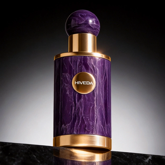
The project is currently a render-only concept, so the images establish design intent rather than manufacturing validation. The bottle has been defined as a fully custom glass body, the spherical cap as resin, and the gold components as zinc alloy. What remains to be developed is how those confirmed material choices will translate into dimensions, interfaces, decoration processes and assembly details without weakening the visual relationships established in the renders.
Gold Framing Gives the Mineral Surface a Structure
The mineral-like treatment is deliberately irregular. If that visual texture continued uninterrupted across every component, the bottle could become difficult to read. The gold-tone zinc-alloy elements solve a different problem: they create edges, pauses and transitions. The lower band gives the cylindrical body a defined base, while the upper ring and neck structure separate the bottle surface from the spherical cap.
The circular front medallion plays a similar role on a smaller scale. Instead of placing branding directly over the veined background, the render creates a distinct metallic field for the HIVEDA name. That choice protects legibility while making the branding element part of the physical composition rather than treating it as a separate printed graphic.
In physical development, consistency across the zinc-alloy components would become important because they are visually read as one family. Their proportions, edge conditions and gold-tone appearance would need to be reviewed together during sampling. The exact plating or finishing specification has not yet been established, so the development task is not to assume a process from the render, but to reproduce the same visual hierarchy through an appropriate production route.
The Spherical Resin Cap Turns Surface Language Into Silhouette
The resin cap is where the concept moves beyond surface decoration. Repeating the mineral-like treatment on a large sphere brings the veining above the bottle shoulder and gives the product a recognisable upper profile. The cap is therefore not an accessory added after the bottle design; it is one of the components carrying the central visual idea.
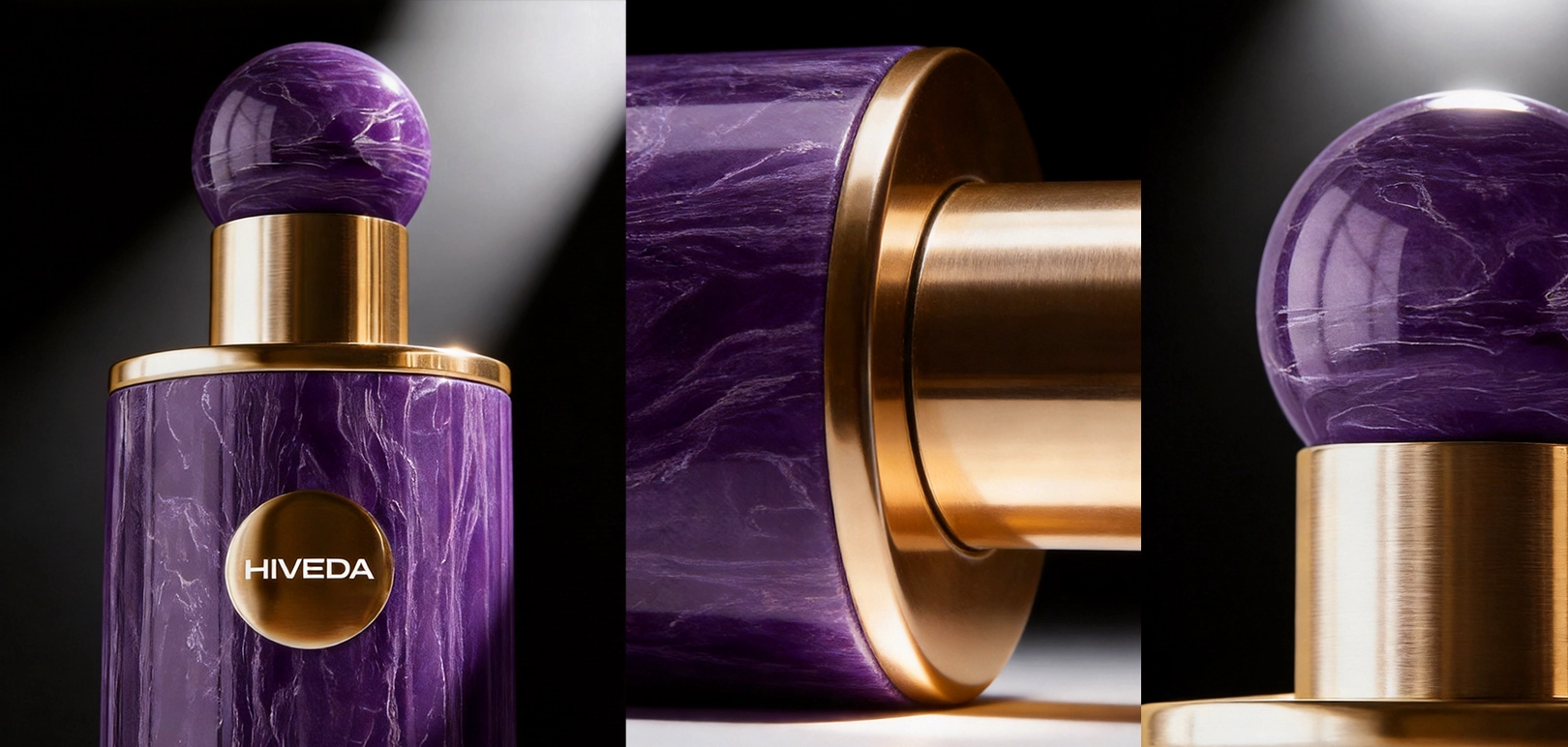
That also concentrates several development questions in the upper assembly. The resin specification, internal fitting structure, cap weight, retention and dimensional relationship with the bottle neck all need to be resolved when the render moves into physical sampling. A sphere is visually simple, but its size makes small proportion changes noticeable. Reducing the diameter, increasing the neck height or changing the transition into the metallic collar could alter the balance of the entire bottle.
Surface consistency also matters. The cap and bottle are different materials, yet the concept asks them to communicate the same mineral-inspired idea. The objective is not necessarily to make resin and glass physically identical; it is to make their color, veining and gloss relationships close enough that the eye reads them as parts of the same design system.
The Development Challenge Is Coordinating Glass, Resin and Zinc Alloy
Once the design route is fixed as a fully custom glass bottle, development should focus on translating the established geometry rather than reopening the question of using an existing bottle. The glass body needs its own technical development around mold geometry, glass distribution, neck finish and compatibility with the selected pump and closure structure. Those details cannot be confirmed from the renders and would need to be reviewed through engineering drawings and physical samples.
The same applies to the secondary components. The resin cap must meet the bottle accurately enough to preserve the intended alignment, while the zinc-alloy elements need to integrate with the glass without making the upper and lower assemblies look visually detached from the body. Because three material systems meet in a relatively compact product, interface quality can become more important than the complexity of any single part.
This is where a bespoke perfume bottle development route is materially different from applying decoration to an existing bottle. The custom glass geometry, resin closure and zinc-alloy components need to be developed as related parts, with dimensions and visual proportions checked together rather than sequentially in isolation.
Physical sampling should therefore answer a small number of high-value questions first: whether the bottle proportions survive the transition from render to glass, whether the spherical closure remains balanced once its real weight and fitting are established, and whether the metal-to-glass interfaces are clean enough to preserve the deliberate framing effect. Those checks are more important at this stage than prematurely optimizing decorative details that can still be adjusted later.
Extending the Material System Across Three Variants and Presentation Packaging
Purple, black and green are intended as three commercial variants, but the renders keep the underlying architecture constant. The cylindrical body, circular medallion, gold-tone framing and spherical closure remain shared design cues while the dominant color changes. This allows the range to differentiate visually without requiring each variant to establish a completely separate packaging language.
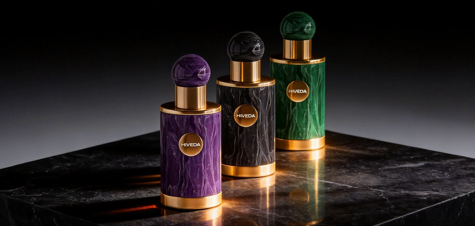
That consistency creates an important development requirement: the shared parts should remain genuinely shared wherever the intended construction allows it. The body geometry, cap proportions, metal-component dimensions and branding position can provide continuity, while the surface color and mineral pattern distinguish the individual variants. Exact production sharing, decoration routes and ordering structure would still need to be confirmed during supplier development.
The presentation box is also part of the confirmed scope. Its render carries the purple mineral language onto a tall rectangular carton, with the circular metallic branding element creating a direct relationship to the bottle. The box should support the product rather than compete with it, so the exterior does not need to reproduce every bottle detail. More important during development will be the internal structure: the insert, bottle clearance and protection around the spherical cap and metal elements need to be evaluated once physical component dimensions are available.
Coordinating a project of this kind involves more than sourcing four separate objects. The custom glass, resin cap, zinc-alloy components and box affect one another, which is why product development and supplier coordination become relevant when the project moves from render to sampling. The purpose of that coordination is to preserve the material hierarchy already established in the concept while resolving the practical interfaces that the render cannot answer.
The next stage is therefore not about adding more visual complexity. It is about proving that the same relationships between glass, resin, metal, color and packaging can survive physical development across all three variants without losing the restraint that makes the concept coherent.