
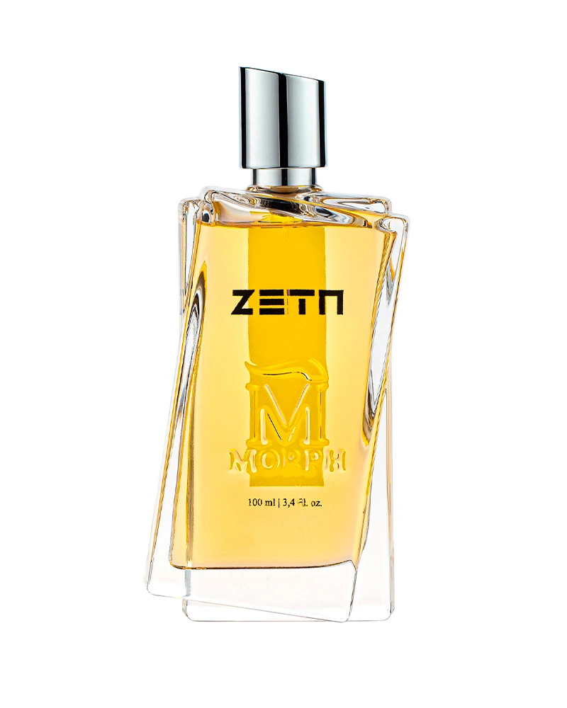
Morph Parfum describes itself as an experimental olfactory space built around innovation, change and metamorphosis. In many fragrance brands, language like this remains largely conceptual: it appears in campaign copy, fragrance names or visual storytelling. Morph gives the idea a more physical role. Its most recognizable perfume bottle appears to shift against itself, creating an object whose silhouette changes depending on the viewing angle.
That relationship between concept and object is what makes Morph interesting from a packaging perspective. The brand does not rely on a different structural bottle for every fragrance. Instead, a recognizable bottle architecture becomes a recurring asset, while colour, graphics, fragrance names and secondary packaging create variation across the portfolio. The result is a system in which the bottle can remain familiar without making every SKU look identical.
Metamorphosis Becomes a Physical Object
The starting point is unusually literal. Morph’s Maison describes the brand as a movement dedicated to innovation, change and “Metamorphosis.” Its bottle then turns that abstract language into something visible. Rather than presenting a perfectly static rectangular block, the form appears displaced, as though one volume has moved away from another.
This creates a productive tension. The underlying bottle remains controlled and architectural, but its edges resist the stability normally associated with a simple rectangular fragrance bottle. From one view, the form can read relatively cleanly; from another, the overlapping contours become much more obvious. The bottle therefore changes visually as it is handled, photographed or displayed.
That matters because distinctive packaging identity does not always require adding more decoration. A silhouette can perform much of the branding work before colour, typography or surface treatment is considered. Once a structural feature becomes recognizable enough, later fragrances can inherit that identity without needing to rebuild it from zero.

The 12-Degree Twist That Defines the Morph Bottle
Zeta provides the clearest official explanation of the geometry. Morph describes the bottle as two bodies rotating at an angle of 12 degrees and links the number twelve to twelve olfactory families and Zeta’s position as the twelfth fragrance in the collection. Whatever meaning a viewer assigns to the finished object, the important packaging fact is that the apparent distortion is not simply a photographic effect: the brand explicitly defines rotation as part of the bottle design.
The visual consequence is a bottle that can remain broadly rectangular while avoiding the anonymity of a standard rectangular flacon. One outline seems to slide past another, creating asymmetry along the sides and base. The geometry adds recognition without covering the bottle in applied ornament.
From a product-development perspective, forms like this also illustrate why a proprietary bottle is a systems problem rather than only a styling exercise. Non-orthogonal geometry can make dimensional consistency, decoration positioning, closure alignment and secondary-packaging fit more sensitive to variation. These are general manufacturing implications, not claims about Morph’s actual production method. For founders considering a similarly structural identity, bespoke perfume bottle development normally has to evaluate the bottle, closure, decoration area and box together rather than treating them as independent objects.
One Bottle, Different Personalities
The value of Morph’s bottle becomes clearer when different fragrances are compared. Nudo keeps the glass visually open, allowing the fragrance colour and central graphics to remain prominent. Animal moves in a very different direction: its bottle uses a dramatic dark-to-amber visual treatment that makes the same general architecture appear heavier and more opaque. Gate 17 changes the mood again with a pale white-to-golden gradient and a light-coloured upper element.
The important point is not that every bottle is identical in every detail. It is that the recurring structural language remains legible while the visual identity of individual fragrances changes around it. The brand can therefore create contrast between products without losing the family resemblance.


For a growing fragrance line, this kind of architecture has a practical advantage: the structural identity and SKU identity do not have to be the same thing. A brand can protect recognition at the collection level while allowing colour, print, labels or boxes to carry much of the differentiation between fragrances. That makes the packaging system expandable rather than dependent on a completely new visual grammar for every launch.
When the Box Carries the Colour
Morph’s secondary packaging gives that idea historical context. A 2015 report from Italia Grafica records that Max Coppeta of Washi won the “L’Italia che comunica col packaging” category with packaging created for Morph Parfum. The report specifically notes that the pack was developed in eight colour tones reflecting different fragrance identities.
That earlier system is useful because it shows how a strong bottle does not need to carry every piece of differentiation itself. The outer box can take on a more flexible role. Colour can shift substantially between SKUs while the bottle provides continuity. The box also creates a larger uninterrupted visual surface, giving typography, emblems and colour fields more room than the front of a relatively narrow perfume bottle.
Zeta illustrates the logic particularly clearly. Its bright yellow packaging creates immediate shelf recognition before the bottle is even examined closely. Animal and Gate 17 move toward very different tonal worlds. Seen together, the system is less about one fixed luxury colour palette and more about allowing each fragrance to occupy its own visual territory inside a recognizable Morph framework.

Morph Beyond the 100 ml Bottle
A hero bottle can define a fragrance brand, but it cannot serve every buying occasion. Morph’s current product architecture extends beyond the 100 ml format into discovery kits, 8 ml travel editions, bath and body products and coffrets. The Luxury Collection sample set, for example, contains twelve 2.5 ml mini bottles, while individual Travel Edition boxes contain two 8 ml travel sizes.
These smaller formats do not attempt to reproduce the full sculptural experience of the main bottle at miniature scale. Instead, they shift the identity work toward the box, naming and repeated Morph graphics. That is commercially useful: sampling needs compactness and efficient organization, while travel formats need portability. The brand can change the container architecture when the usage occasion changes without losing the connection to the fragrance portfolio.


This separation between hero packaging and access formats is an important part of scalable fragrance development. Recognition can come from one flagship object, while discovery, gifting and travel are allowed to solve different functional problems. Morph’s portfolio demonstrates how those formats can coexist without requiring the signature bottle to be mechanically miniaturized into every product category.
The System Keeps Moving
Morph’s packaging language is not frozen around its earlier fragrances. The current official site divides perfumes into Luxury, Les Exclusifs, Ice and G Collection, while the wider catalogue also includes discovery, travel, bath and body and coffret formats. In 2026, Fatal Bloom joined the newer G Collection, with Morph identifying Jordi Fernandez as its perfumer. A recent G Collection travel presentation also described the collection as a collaboration with Givaudan.
What is interesting is not simply that Morph continues launching fragrances. It is that new products enter a brand world where a strong physical signature already exists. That creates a different design challenge from inventing a visual identity for the first bottle: each new launch has to decide how much of the established system to inherit and where it is useful to introduce change.

That is where the original idea of metamorphosis becomes more useful than a one-time design metaphor. Morph can change colour, fragrance story, collection positioning, scale and presentation format while keeping enough recurring visual structure to remain recognizable. The 12-degree twist therefore matters less as an isolated technical curiosity than as the foundation of a packaging identity capable of surviving change.