
Three scents can share a single visual identity. For NOTAROM, a bespoke blue ceramic vessel gives the candle collection its common shape, while packaging numbers and other information distinguish the fragrances.
The client chose a custom mold to establish brand recognition. HIVEDA handled the vessel and outer-box design and production, along with candle filling and shipment. The finished collection brings those responsibilities together in one clearly recognizable form.

A Bespoke Ceramic Vessel for Brand Recognition
The vessel gives this project its strongest visual signature: a broad upper body above a narrower base, horizontal bands around the rim and vertical ribs below. Its outline remains distinctive when viewed beside the box or as part of the three-candle display.
This is a concrete reason to consider bespoke scented candle development: the container’s geometry can express the brand. In this project, the custom mold served that stated objective, with the same form used across all three scents.
A Stepped Silhouette, Vertical Ribs and Blue
The upper body projects beyond the base, creating a pronounced step in the profile. Rounded horizontal bands frame the opening, while closely spaced vertical ribs give the broader body and lower base a different rhythm.
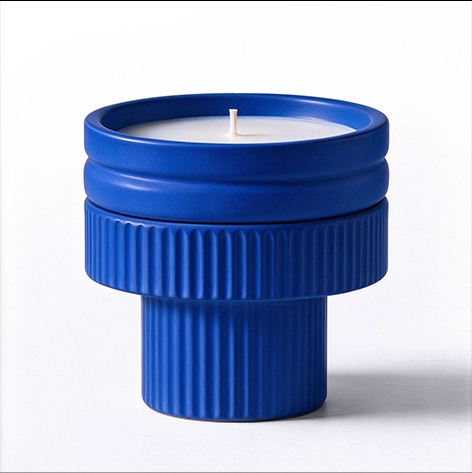
Blue runs across the whole vessel. The raised and recessed areas catch light differently, making the surface detail visible within a single color. The design has several points of recognition working together: its outline, the change in width, the ribbed texture and the blue surface.
Three Scents Share the Same Vessel and Color
All three fragrances use the same ceramic shape and blue color. Placed together, the candles repeat the same proportions and details, giving the collection a consistent appearance.

That repetition defines what stays shared across the range. The scent changes within the collection, while the vessel retains the same identity. For a brand planning a similar launch, these are separate decisions: which features should identify the collection, and which information should identify the individual fragrance?
The Packaging Carries the Scent Distinction
The outer boxes use the same structure and blue-and-white color scheme across all three scents. Each front carries the NOTAROM name, a subtle outline of the vessel and a number: 01, 02 or 03.

The vessel graphic connects the packaging to the object inside. Numbering and other packaging information carry the scent distinction, allowing the ceramic color and shape to stay consistent across the range. HIVEDA designed and produced these boxes as part of the project.
For a collection using this approach, the association between each number and its scent needs to remain clear wherever customers select the product. A shared appearance establishes the family; the information on the packaging identifies the individual choice.
HIVEDA’s Scope: Design, Production, Filling and Shipment
HIVEDA’s scope covered both visible components and the filled product: ceramic vessel design and production, outer-box design and production, candle filling and shipment. The project was delivered as a finished candle collection.
For brands developing a scented candle collection, NOTAROM offers a useful starting decision: define the elements that belong to the brand across every scent, and identify where fragrance-specific information will sit. Here, the bespoke form and blue color remain constant, with the distinctions carried on the packaging.