
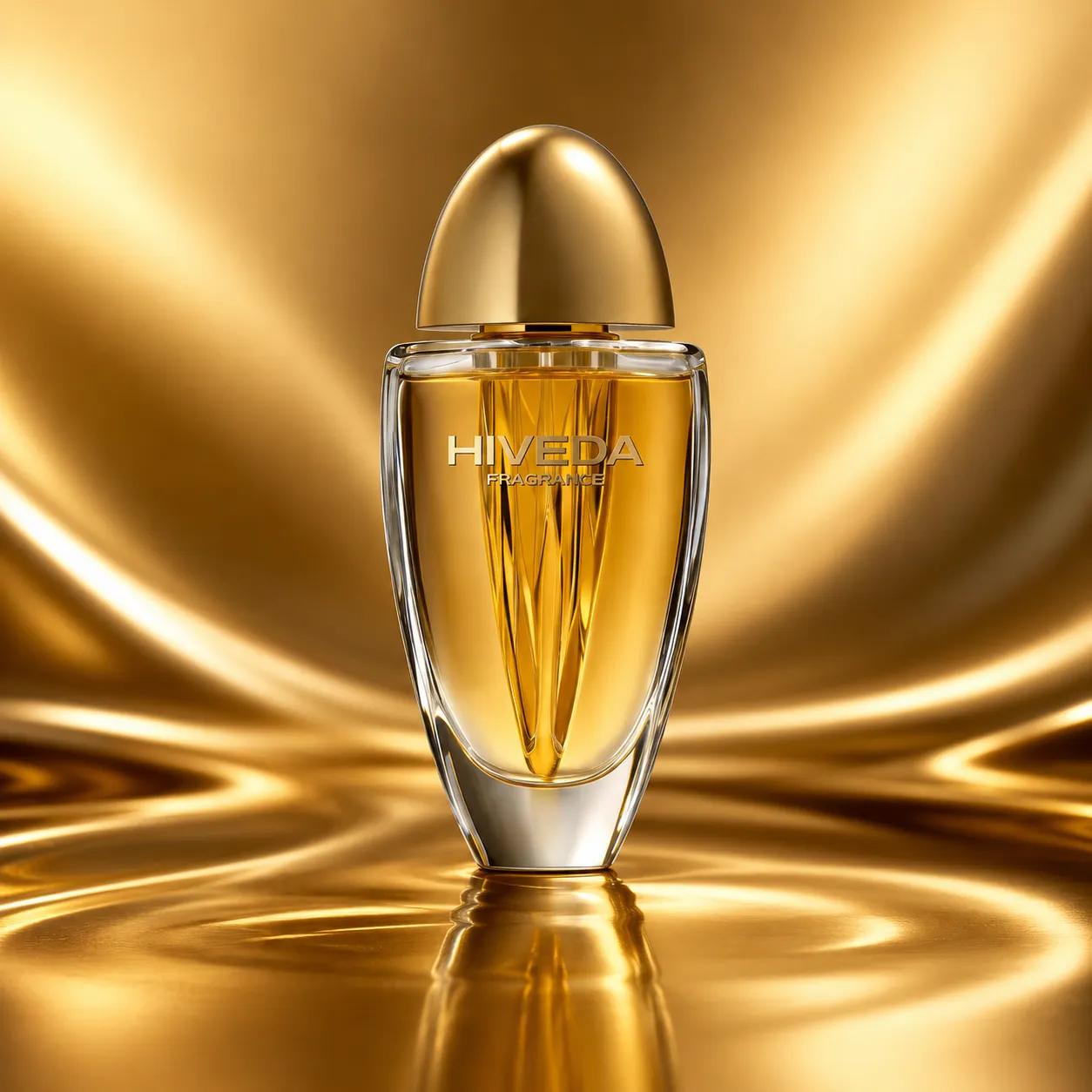
BD-PF-02 is a radiant glass perfume bottle concept built around transparency, amber-toned liquid color, and a strong vertical inner structure. The design does not depend on a large label or heavy surface graphics. Its identity comes from the way light moves through the bottle body, the faceted inner lines, and the rounded gold dome cap above the clear shoulder.
This concept could work for a fragrance brand looking for a more luminous bottle direction: warm, reflective, sculptural, and display-focused. For brands exploring bespoke perfume bottle design, the strength of BD-PF-02 is that the bottle uses structure and light as part of the brand language.
A Bottle Concept Built Around Inner Light
The first impression of BD-PF-02 is created by the relationship between the clear outer body and the warm color inside. The bottle shape is tall and rounded, with a tapered lower section and a thick base that gives the form stability. This allows the bottle to feel vertical and slender without looking fragile.
The transparent body acts like a frame. Instead of hiding the fragrance, it makes the inner color part of the design. The amber direction gives the bottle warmth, while the clear side wall and base create contrast around the liquid. This is useful for a fragrance concept where the product should feel luminous from the front, side, and angled views.
The bottle’s front profile is also commercially practical. It has a clear face for branding, a controlled width for shelf display, and enough depth to create internal reflection. A brand using this direction would need to consider how liquid color, glass thickness, and lighting conditions affect the final appearance in retail, photography, and sample review.
How the Vertical Structure Creates Depth
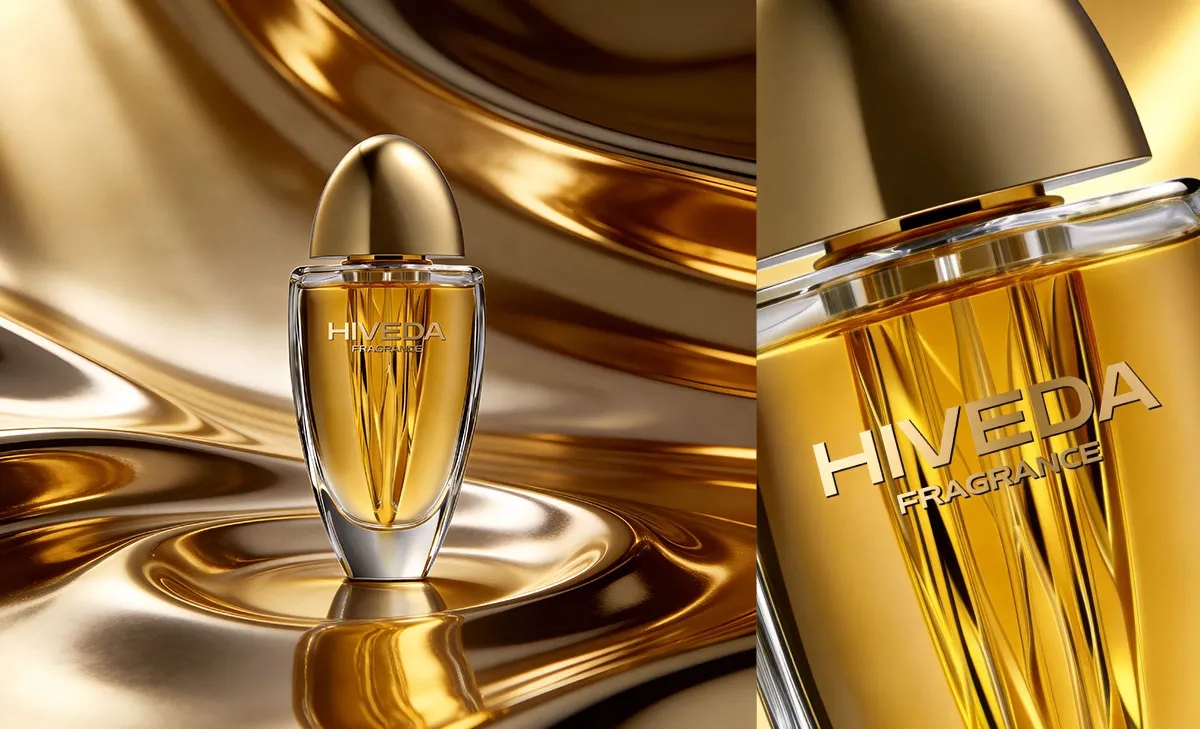
The most distinctive feature of BD-PF-02 is the vertical structure inside the bottle. The lines appear like faceted ribs, fan-shaped rays, or a flame-like form rising from the lower center. This inner geometry gives the bottle visual movement without adding an external pattern.
This matters because transparent perfume bottles can sometimes feel too plain when the body is only smooth glass and liquid. Here, the internal structure gives the eye something to follow. It draws attention downward from the logo area, then back into the base, creating a sense of depth and refraction.
If developed physically, this feature would need careful 3D modeling and mold evaluation. The angle, depth, and spacing of the vertical lines would affect how light passes through the bottle. If the structure is too shallow, it may disappear when filled. If it is too deep, it may create production or decoration challenges. The final balance should be checked through render review, prototype evaluation, and sample testing.
Why the Dome Cap Controls the Visual Weight
The gold dome cap is not only a closure detail. It controls the whole upper weight of the concept. The bottle body is transparent and visually open, while the cap is solid, rounded, and reflective. This contrast makes the cap a strong identity point.
The cap shape also changes the bottle’s character. A flat cap would make the bottle feel more commercial and direct. A tall cylindrical cap would make it feel more rigid. The dome cap gives the concept a softer crown-like finish, while still keeping the silhouette controlled and symmetrical.
The development challenge is proportion. The cap needs to feel substantial enough to support the radiant gold direction, but not so large that it overpowers the glass body. Its surface finish would also need testing. A gold finish should be checked for color consistency, scratch resistance, fingerprint visibility, and how it matches the box surface if matching packaging is used.
Packaging That Extends the Same Radiant Geometry
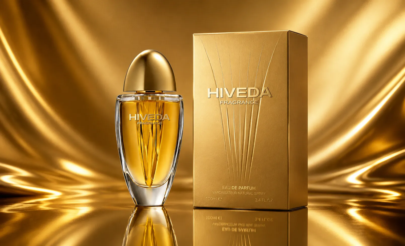
The matching box shown with BD-PF-02 extends the bottle’s vertical structure into packaging. This is a strong direction because the box does not simply repeat the bottle outline. It translates the inner glass lines into a flat surface treatment, helping the bottle and packaging feel like one product set.
For a concept like this, the packaging should support the reflective gold mood without becoming visually noisy. A controlled gold paper surface, subtle embossing, debossing, or foil detail could help the vertical motif feel tactile. The logo area should remain readable, especially if the surface has a metallic or textured finish.
The bottle and box should be developed together. The dome cap, amber liquid direction, clear glass wall, and vertical motif all rely on light. If the box finish is too matte, it may feel disconnected from the bottle. If it is too reflective, it may compete with the glass. Packaging proofing should test this balance before production direction is confirmed.
From Concept to Bespoke Development
BD-PF-02 is closer to a bespoke development route than a simple ready bottle customization because the identity depends on the inner glass structure, the cap relationship, and the packaging surface language. The first stage would be refining the bottle proportions through 3D modeling, then checking the front, side, and angled views before sample development.
Key development checks would include glass wall thickness, base weight, inner line depth, pump compatibility, cap tolerance, logo decoration on curved transparent glass, and packaging insert fit. The liquid color direction should also be reviewed because the same bottle may look different with amber, pink, or purple fills.
- 3D modeling for the tall rounded body and internal vertical structure
- Glass thickness and base stability review
- Cap proportion, finish, and pump compatibility testing
- Logo decoration test on curved transparent glass
- Liquid color and glass refraction review
- Gold packaging proofing with vertical motif detail
- Insert fit, filling route, assembly planning, and export-ready packaging review when required
HIVEDA can help move a concept like BD-PF-02 from visual direction into fragrance product development, including 3D modeling, sample review, mold development discussion, cap and decoration testing, packaging proofing, filling, assembly, and export coordination. For brands comparing concept routes, this direction works best when the bottle and box are treated as one complete perfume product system.
The design strength of BD-PF-02 is its disciplined use of light. The transparent body reveals the fragrance color, the vertical structure creates depth, the dome cap adds a strong top silhouette, and the packaging carries the same geometry outward. This gives the concept a clear development logic without relying on excessive decoration.