
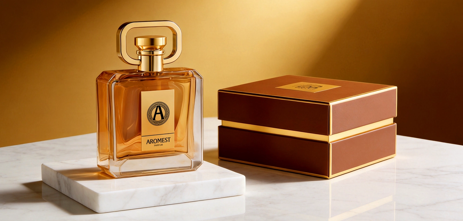
A custom cap can change the character of an existing perfume bottle. In this HIVEDA project, a rounded rectangular frame gives the top of the bottle a distinctive silhouette, while the gold-colored front detail and brown-and-gold box connect the packaging around it.
The project combined an existing bottle shape with dedicated cap development and a full service scope extending through fragrance, filling, assembly and export. For a buyer balancing brand identity, MOQ and development budget, it offers a concrete example of where custom development can be concentrated.
Brand Identity, MOQ and Budget Shaped the Brief
The client’s priorities were brand recognition, minimum order quantity and development budget. The project brought those concerns together through an existing bottle shape, custom bottle decoration, a specially developed cap and coordinated outer packaging.
The distinction between the bottle and the cap matters. The glass shape came from an existing design; the cap required its own design, mold development and production. This was a selective approach to customization, with a clearly identifiable part of the packaging receiving dedicated development.
For buyers considering a similar route, the useful question is where a new shape will make the strongest contribution to the product. In this case, the open frame above the bottle provides an immediate visual answer.
An Existing Bottle Provided the Starting Point
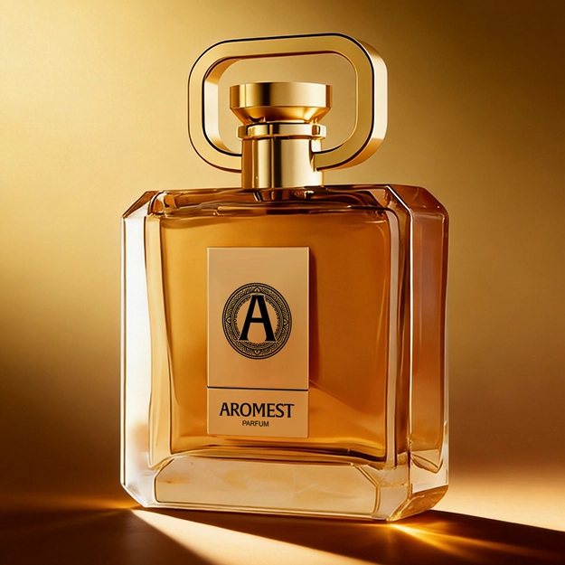
The selected bottle has a broad rectangular front, defined edges and a substantial transparent base. Its front face provides room for the brand detail, while the clear perimeter keeps the outline visible around the warm amber presentation.
That geometry gives the cap a firm visual base. The bottle’s upright sides and broad shoulders relate to the cap’s rounded rectangular frame, making the two shapes read as parts of one composition. The glass does not need an unusual silhouette for the complete bottle to have a distinctive outline.
HIVEDA handled bottle selection and decoration for the project. Buyers exploring ready-design perfume bottles can evaluate the same relationship: the space available for branding, the proportions of the shoulders and the amount of visual emphasis a proposed cap adds.
An existing bottle sets certain boundaries for development. Its body shape remains fixed, so the design work needs to use the available surfaces and proportions deliberately. Here, the broad front and defined edges provide a clear setting for both the central brand detail and the more expressive cap.
The Custom Cap Gave the Bottle Its Signature Outline
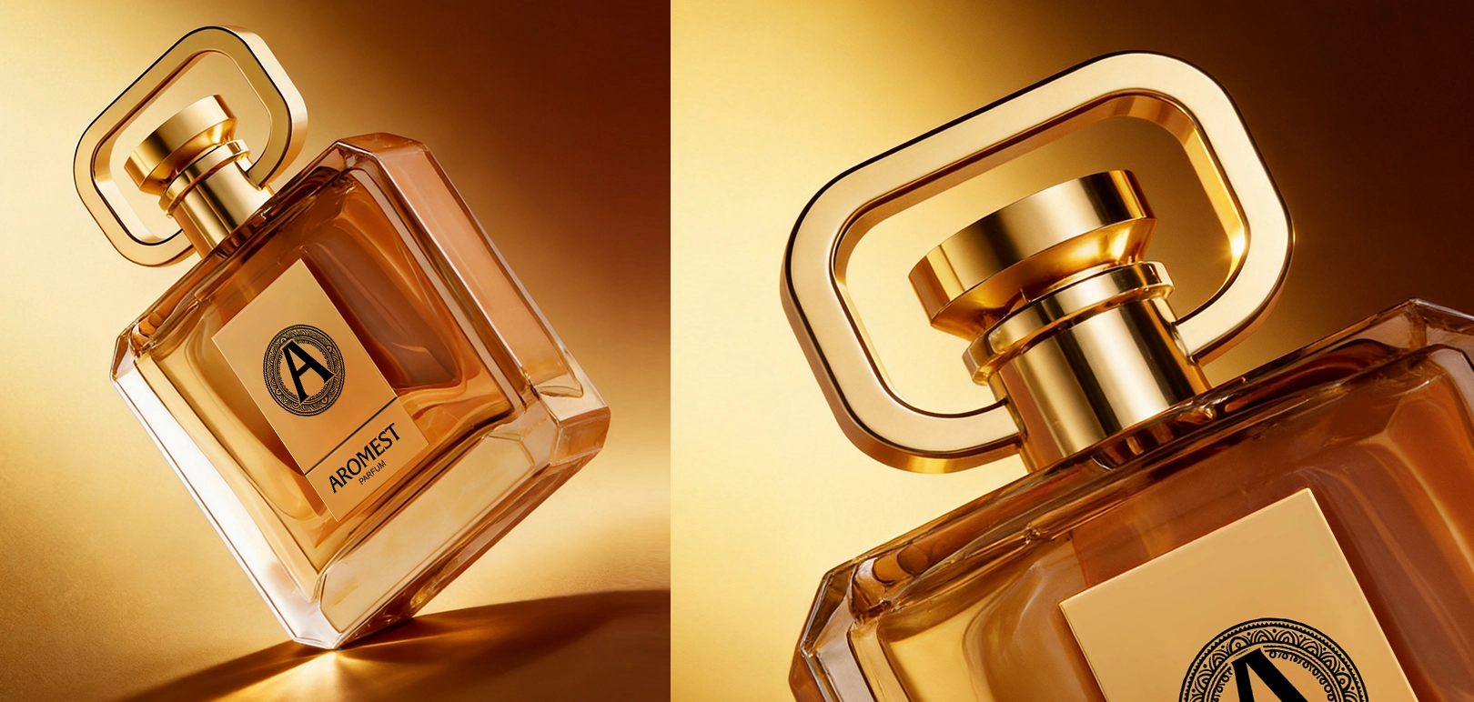
The cap’s most noticeable feature is the open rounded rectangle surrounding its central form. The space inside the frame is as important to its appearance as the gold-colored surfaces: it makes the outline easy to read and keeps the upper part of the design visually open.
The central cylindrical section connects that wider frame to the bottle neck. Seen together, the cap has a broad upper silhouette and a narrower point of connection. The close-up makes this relationship especially clear, showing how the frame sits above the shoulders without obscuring the front of the bottle.
HIVEDA’s scope included the cap design, tooling and production. The custom development is visible in the shape itself, giving the packaging a recognizable feature beyond its printed brand name.
For a similar development brief, the cap should be judged on the complete bottle. A striking shape viewed on its own may carry a different visual weight once paired with the shoulders, front decoration and box. Reviewing those proportions together is a useful part of deciding whether a custom cap earns its place in the design.
The Front Detail and Box Completed the Presentation
The front brand detail repeats the cap’s gold color in a tall rectangular format. The dark emblem and lettering create a focal point within that panel, while the surrounding bottle remains comparatively open. This gives the upper silhouette and the front branding separate, readable roles.
The outer box extends the same palette through brown surfaces, gold-colored edges and a matching emblem. Its broad rectangular form also relates to the bottle’s geometry. Together, these details connect the bottle to its packaging without requiring every surface to carry the same treatment.
HIVEDA designed and produced both the front brand detail and the outer box. These were part of the project’s complete packaging scope, alongside the bottle decoration and custom cap.
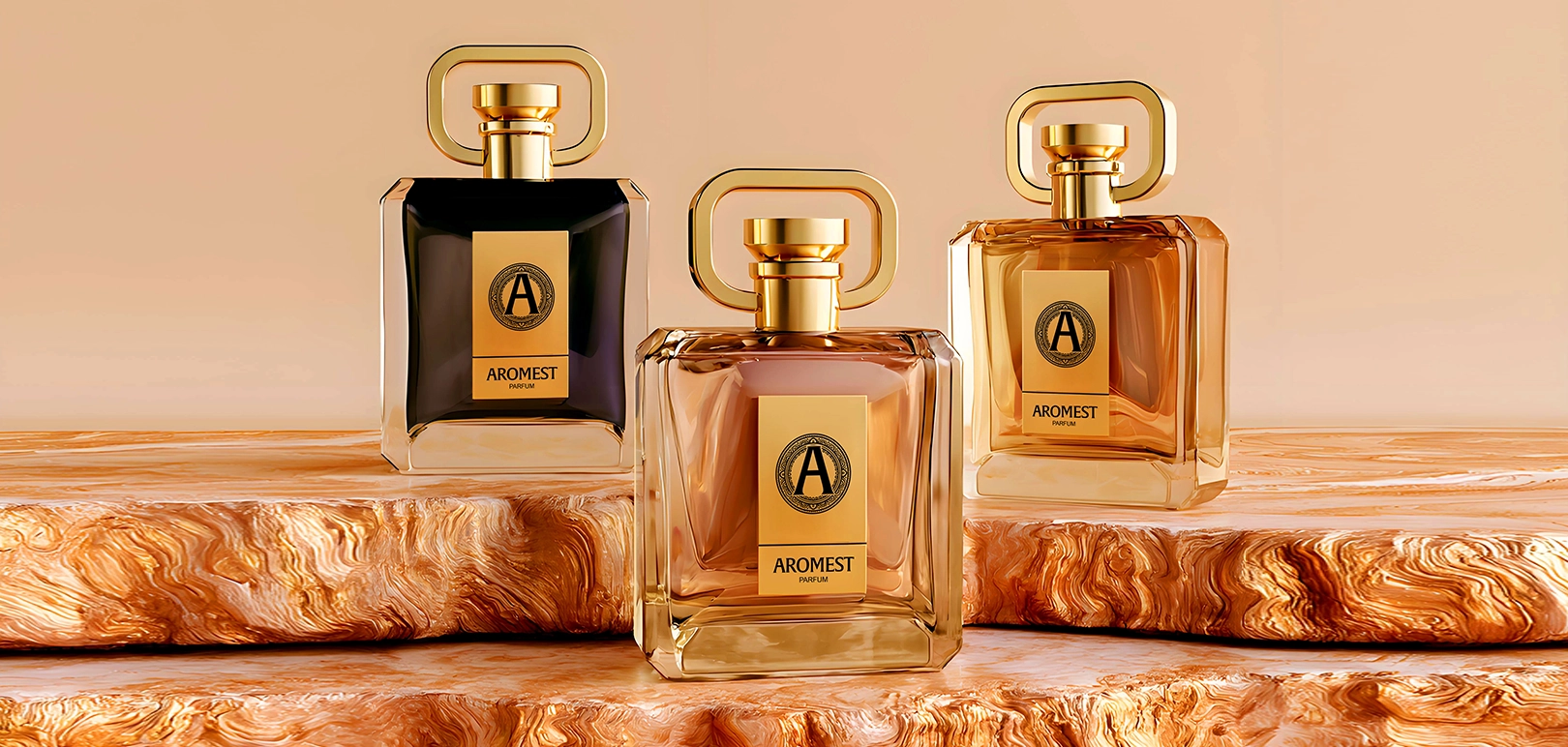
The additional colorways shown below are reference options. They illustrate how a change in the bottle’s color presentation alters the balance of the gold cap and front detail; they do not represent three produced SKUs.
HIVEDA Carried the Project Through Filling and Export
HIVEDA’s responsibility covered the full product scope: bottle selection and decoration, cap design and mold production, front branding, outer packaging, fragrance and filling, assembly and export.
The packaging work and the finished perfume therefore sat within the same project responsibility. The cap and box were developed as components of the product being delivered, with HIVEDA also handling the fragrance, filling and assembly work.
For a brand evaluating a development partner, this scope is worth making explicit. Packaging design, component supply and finished product delivery involve different responsibilities. A project brief should identify who owns each part, including the handover from packaging components to filled and assembled goods.
This case provides an example of HIVEDA’s design-to-export fragrance services applied to an existing bottle with a custom cap. The design route and the service scope are separate decisions: a ready-design bottle can still form part of a fully coordinated finished perfume project.
Where Custom Development Makes the Difference
The practical value of this project lies in how the packaging divides the work of creating identity. The existing bottle supplies the main body and front surface. The custom cap contributes the distinctive upper outline. Decoration, the brand detail and the box connect those components through color and graphics.
For brands considering a similar combination, three decisions deserve attention:
- Identify the feature that should make the product recognizable. It may be the cap silhouette, the bottle shape or a particular relationship between the two.
- Define the full customization scope before comparing quotations. Cap tooling, bottle decoration, front branding, boxes, filling and assembly each need a clear place in the brief.
- Discuss MOQ and development budget against the complete specification. An existing bottle is one part of that specification; the custom components and finishing requirements still need their own review.
In this project, the visible point of distinction sits above the shoulders: the rounded open frame gives the bottle its signature outline. The coordinated front detail and box carry that identity through the rest of the presentation.