
Bon Parfumeur’s perfume bottles look unusually easy to catalogue. Large three-digit numbers sit on coloured labels. Bottle geometry repeats from fragrance to fragrance. Three ingredients give the customer an immediate scent reference. What first appears to be a restrained graphic identity is actually a navigation system for a growing fragrance collection.
That system becomes more interesting when set against the brand’s creative origin. Founder Ludovic Bonneton describes perfume through memories, travel and emotion, yet those experiences arrive on the shelf under references such as 001, 101, 302 and 602. Bon Parfumeur therefore operates between two languages: the personal language of memory and the orderly visual language of a perfumer’s workshop.
Bon Parfumeur Turns Memories Into Reference Numbers
Bon Parfumeur dates its beginning to 2017, when Bonneton returned from Colombia after living among tropical scents including cocoa, coffee and flowers. The house presents fragrance as a way of recording experiences rather than simply assigning conventional product names to finished compositions.
The numerical naming system connects that emotional starting point with a much more technical-looking object. In an interview with PLEZURO, Bonneton explained that the numbers refer back to markings found on bottles in a perfumer’s workshop. The effect is important: personal memories are not presented as long narrative titles. They are filed as references.
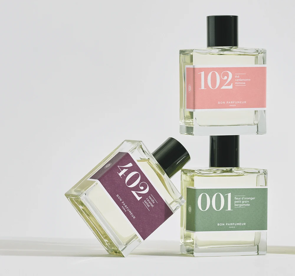
This tension separates Bon Parfumeur from brands where each perfume behaves as an independent visual story. Here, individual memories enter a pre-existing framework. The framework does not remove emotion; it gives those memories an address inside the collection.
The First Digit Does More Work Than a Fragrance Name
The code is readable once its grammar is known. Bon Parfumeur currently organizes its perfumes into ten families, from 000 for Cologne through 900 for Specials. According to the brand’s classification, the first digit identifies the olfactory family, while the final two digits indicate the fragrance’s order of appearance within that family. In the floral family, for example, 101 precedes 102.
Colour adds a second layer. Floral references use pink, amber and spice references are associated with red, and woody perfumes with dark green. Three highlighted ingredients add another route into the product. The customer therefore has several ways to read one small label: number, family colour and ingredient cues.
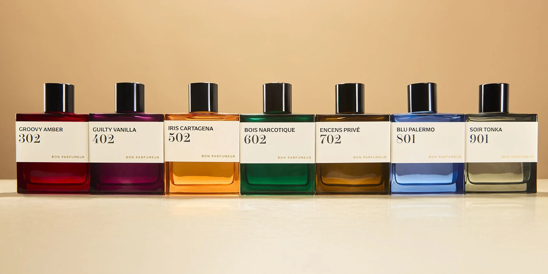
For a large assortment, that matters commercially as much as graphically. A new fragrance does not need a completely new packaging language to explain where it belongs. It can enter an existing family and gain recognition from the system around it.
One Bottle Grammar Lets Colour Build the Collection
The classic Eau de Parfum range reinforces that logic physically. Across references such as 001, 101, 103 and 602, the bottle keeps a similar rectangular silhouette, transparent presentation and dark cylindrical upper element. The most immediate visual changes happen across the front graphic field rather than through radically different bottle structures.
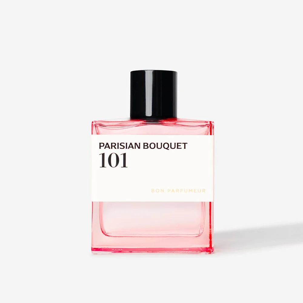
From a packaging perspective, this creates a useful form of controlled variation. Structural consistency concentrates differentiation into artwork, colour and information hierarchy. That can make a collection visually coherent even when the fragrance directions are very different.
The important point is not that every fragrance brand should use one bottle. Bon Parfumeur works because the repeated object is paired with a sufficiently strong coding system. Remove the number and colour architecture, and the same structural repetition would carry far less information.
Thirty Miniatures Reveal the System Better Than One Full-Size Bottle
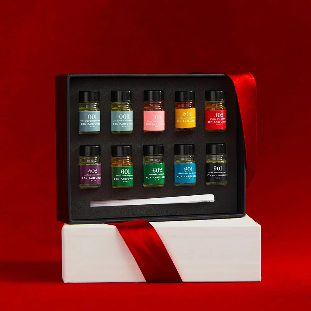
The collection becomes easiest to understand when it is miniaturized. Bon Parfumeur’s Collection Gift Set places 30 small references together in one presentation format. The brand compares the format with perfumer’s samples, which brings the workshop reference behind the numbering system into physical view.
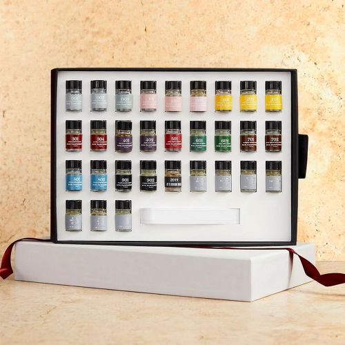
A single bottle shows a fragrance. A tray of miniatures shows a taxonomy. Repetition makes the differences easier to compare: the black upper elements align, bottle proportions repeat, and the coloured identifiers move across the assortment like indexing tabs.
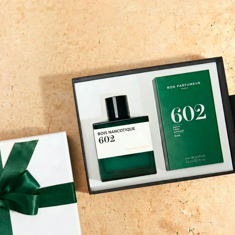
The brand also carries its identity across different selling formats. In the 100+15ml gift set, full-size and travel-size fragrances sit beside a restrained presentation box. The package does not need to invent a separate identity for the smaller format; scale changes while the fragrance code remains recognizable.
The Signature Collection Pushes Colour Beyond the Label
The Signature Collection tests the system under a more visually intense treatment. Bon Parfumeur describes this range as a new expression of its Eau de Parfum universe, using lacquered bottles while continuing to associate colour with fragrance families.
403 Myrrh Shadow shows the shift clearly. The familiar rectangular proportions and three-digit reference remain, but the darker bottle body, pale graphic field and gold-tone upper element create a stronger contrast than the classic clear-bottle system. Recognition survives because Bon Parfumeur changes the expression without discarding the code.
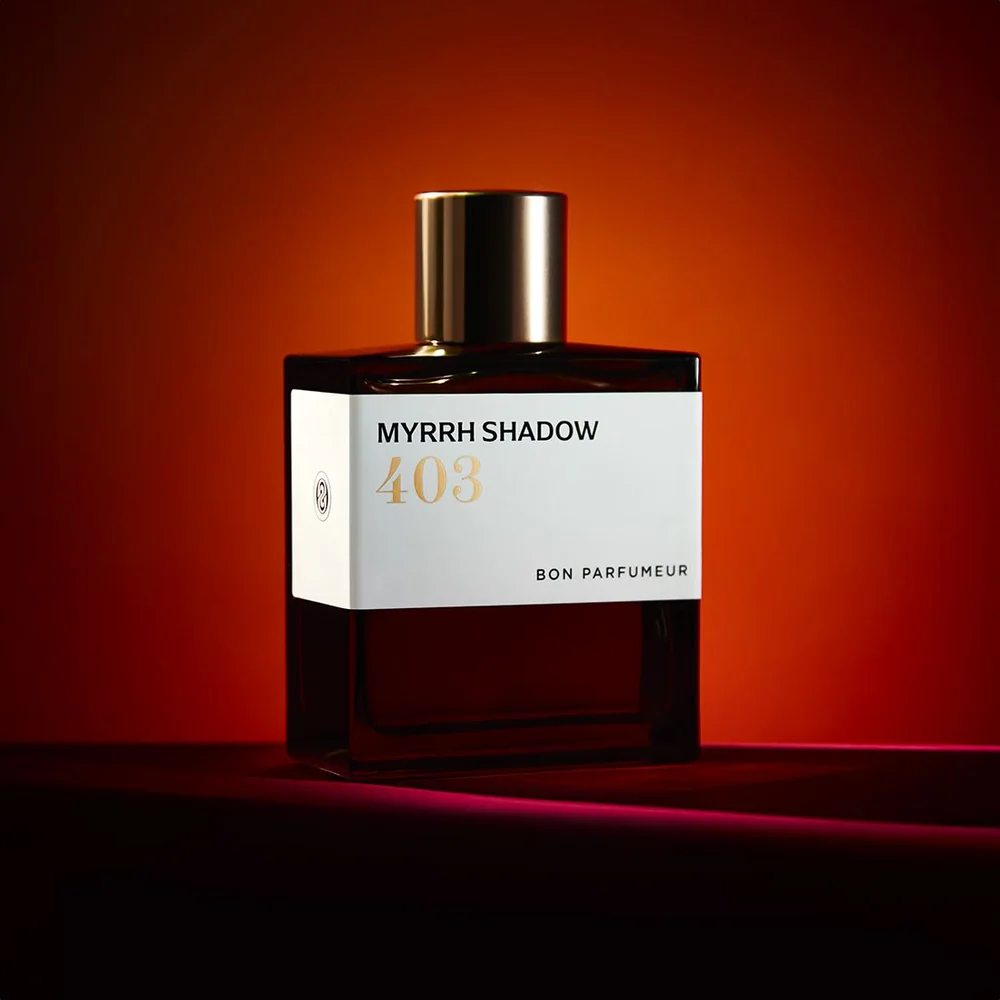
For collection development, this is more interesting than simply launching a different bottle. The extract range demonstrates how a brand can create hierarchy inside an established visual language. The product becomes darker and more assertive, but it still reads as part of Bon Parfumeur before the fragrance is identified in detail.
When a Colour Code Has to Survive More Than Perfume
The system also extends beyond Eau de Parfum. Bon Parfumeur uses large numerical identifiers on candles and diffusers, adapting the workshop-like graphic language to different container types. The geometry changes, but the importance of the number does not.
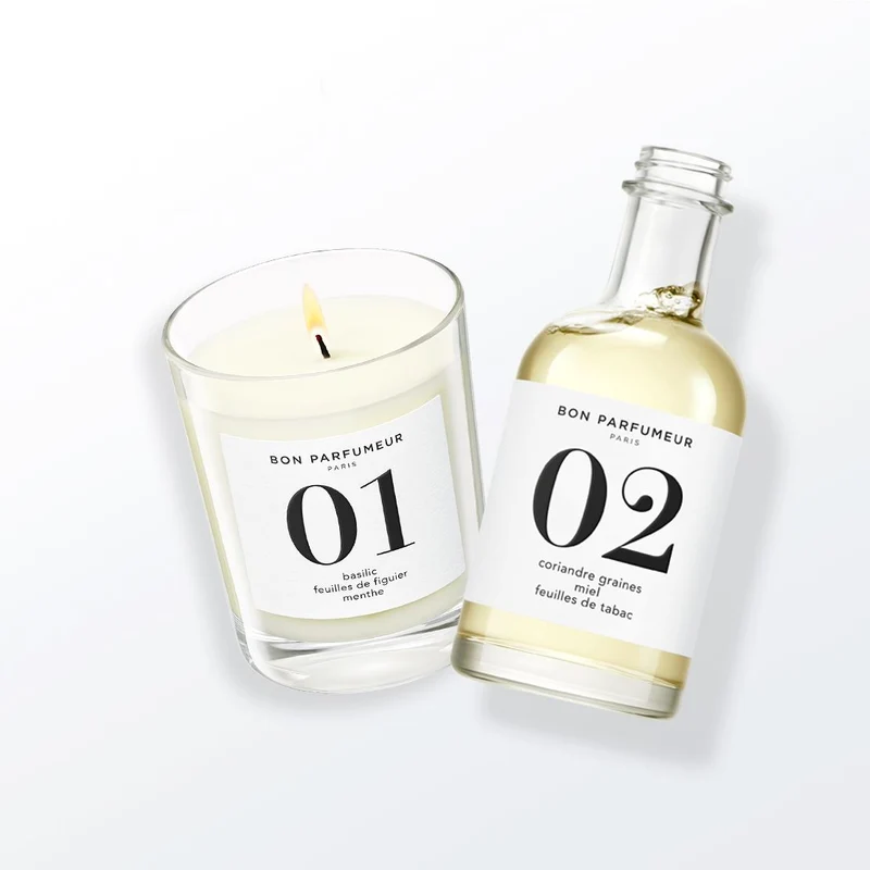
An official Bon Parfumeur production article adds a practical dimension to this visual consistency. When discussing printed packaging, the brand says the colours used to signify its olfactory families need to remain consistent between production runs and across perfumes, candles and diffusers.
That moves colour from branding theory into production discipline. Once a colour carries navigational meaning, variation between labels, cartons or product categories can affect how the whole system reads. For B2B teams working across multiple formats, this is where packaging and production coordination becomes relevant: artwork, print, colour approval, component sourcing and final assembly have to support the same identity rather than behave as isolated tasks.
Bon Parfumeur’s Real Asset Is the System Between the Objects
Bon Parfumeur is not built around one spectacular sculptural bottle. Its stronger visual asset is the relationship between several relatively simple elements: a repeated bottle grammar, a three-digit reference, family colour, ingredient information and formats that allow those codes to reappear at different scales.
That relationship explains why the 30-miniature box is as revealing as a full-size bottle, and why a darker perfume extract can still remain legible as Bon Parfumeur. Each object contributes to a larger catalogue rather than competing to become an isolated hero product.
The result is a useful contradiction. Bonneton’s source material is personal – memories, places and emotional associations – but the collection presents those memories with the logic of an archive. Bon Parfumeur makes the perfumer’s code visible, then uses packaging to keep that code readable as the assortment expands.