
A perfume bottle is usually encountered in the hand, on a dressing table or at a retail counter. A reed diffuser has a different relationship with its surroundings. It can remain visible in the same room for months, with the vessel, reeds and surface finish becoming part of the interior while the fragrance performs its function.
That distinction helps explain LINARI. The Hamburg fragrance brand is closely connected to designer Rainer Diersche, whose background includes running interior design stores in Hamburg and Munich and studying the clarity of Italian design. LINARI’s current brand history says its products are developed in-house by Diersche from initial concept through the finished object.
Seen from that starting point, LINARI’s packaging is less about finding one dramatic signature bottle than building fragrance objects through material, texture and surface treatment. Velvet, wood, aluminium, faceted glass, metallic graphics and crystals give different collections their identities while the underlying forms often remain comparatively restrained.
LINARI Started With the Room, Not the Wrist
Home fragrance is not a secondary category in LINARI’s visual world. Diffusers sit at the centre of the brand’s current assortment alongside room sprays and scented candles, while personal Eau de Parfum forms a separate collection. That room-first perspective changes how the packaging can be read.
A diffuser has to work at a distance. The label needs to remain legible, but the overall object also competes with furniture, lighting, ceramics and other decorative elements. LINARI’s own history repeatedly links fragrance with purist form, atmosphere and interior spaces such as homes, hotels, restaurants and lobbies.
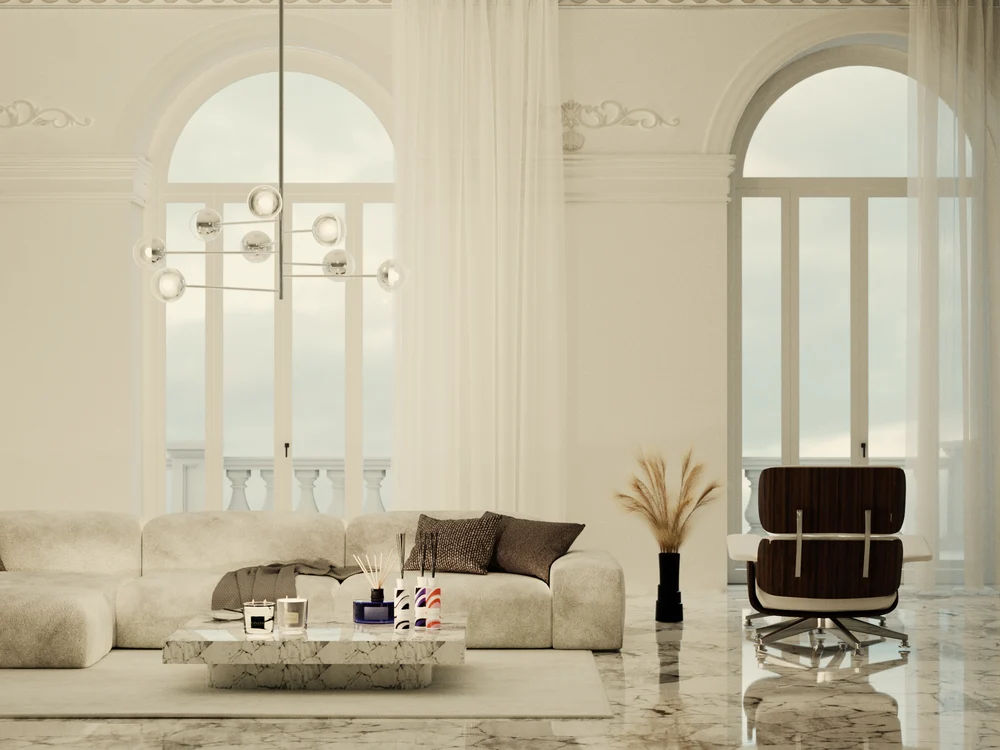
This does not mean every LINARI product resembles furniture. The more useful observation is that surface and touch receive an unusually large share of the design work.
The Cylinder Stays Quiet While the Surface Changes
OCEANO gives a useful baseline. The 500ml diffuser uses an amethyst-coloured Italian glass bottle, ash wood cap, natural-coloured reeds and a label with a soft-touch finish and glossy embossed lettering. The vessel remains straightforward enough that glass colour, wood and label finish can be read immediately.
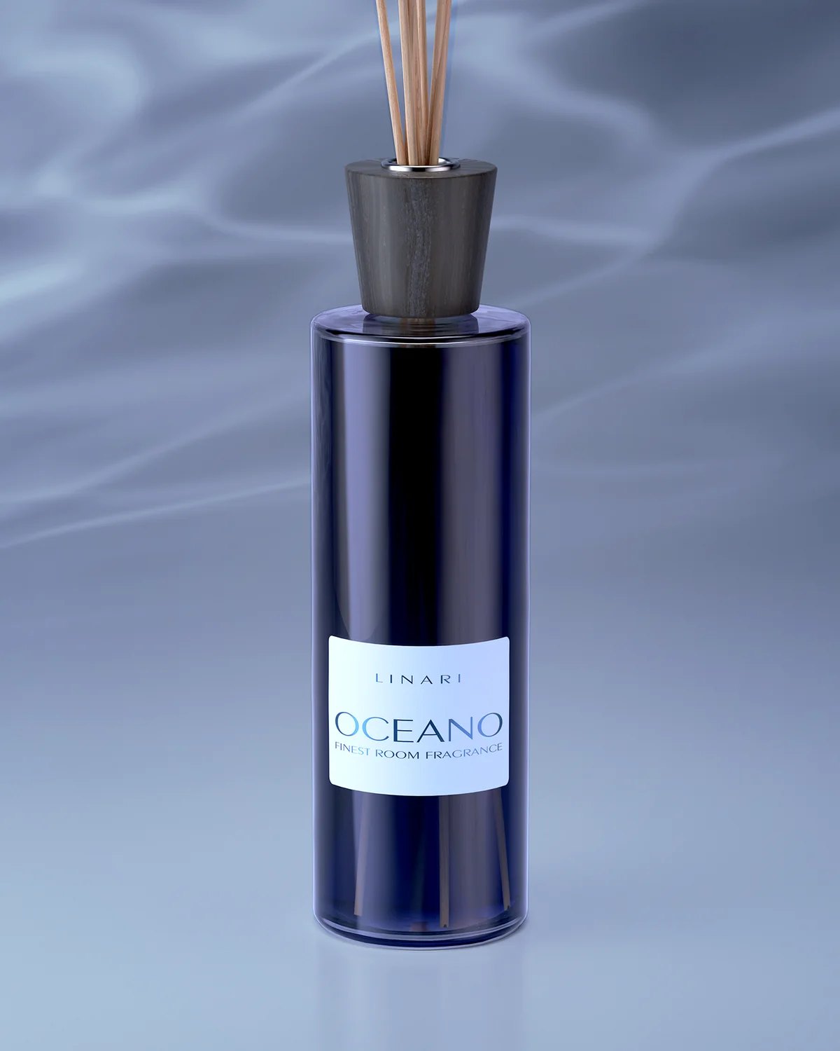
Other LINARI families start from similarly upright diffuser proportions but change what the customer sees and touches. This creates a collection architecture based less on constant structural reinvention and more on the treatment of the visible surface.
For product-development teams, that distinction matters. A shared visual grammar can still produce considerable SKU separation when colour, tactile finish, top element, label construction and decorative treatment are allowed to change systematically.
Velvet and Aluminium Bring the Interior Onto the Bottle
SENSO makes the interior connection explicit rather than leaving it to interpretation. LINARI describes the product as an Italian glass bottle covered in anthracite-coloured velvet, with brushed aluminium finishes on the cap and label. The brand specifically connects velvet and aluminium with materials otherwise used predominantly in interior design.
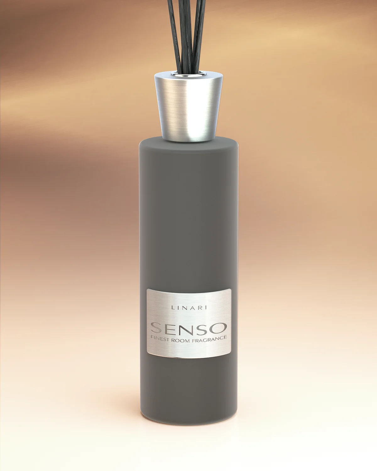
The contrast is important. The form itself is not visually complicated, but the surface asks more from manufacturing than a simple printed label on clear glass. Velvet, brushed metal and glass have different tolerances, handling requirements and visual behaviours. From a general packaging perspective, the more materials that meet on one object, the more important alignment, finish consistency and assembly become.
LINARI therefore shows how a minimalist silhouette does not automatically mean a simple packaging programme. Structural restraint can move complexity somewhere else.
FENICE Turns Glass Structure Into Decoration
FENICE changes the mechanism again. Instead of relying primarily on applied colour or a textile covering, LINARI describes the bottle as having a three-dimensional square glass structure with rounded corners that reflects light across the surface. Black velvet appears on the upper element and label, with silver foil lettering providing another material contrast.
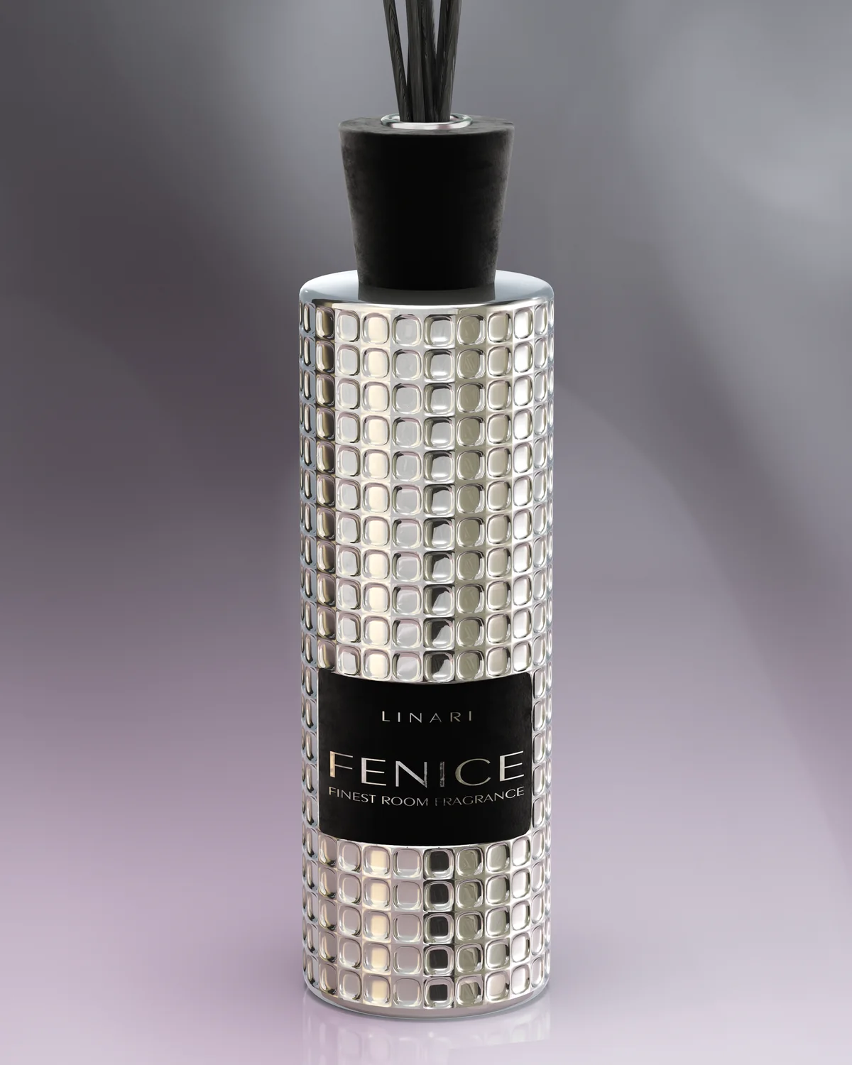
That shift is useful because it separates two different approaches to differentiation. SENSO changes the vessel through an applied tactile covering. FENICE makes the glass geometry visually active. Both remain recognizably LINARI, but they put manufacturing emphasis in different places.
From Skyline Graphics to 990 Crystals, LINARI Builds a Surface Hierarchy
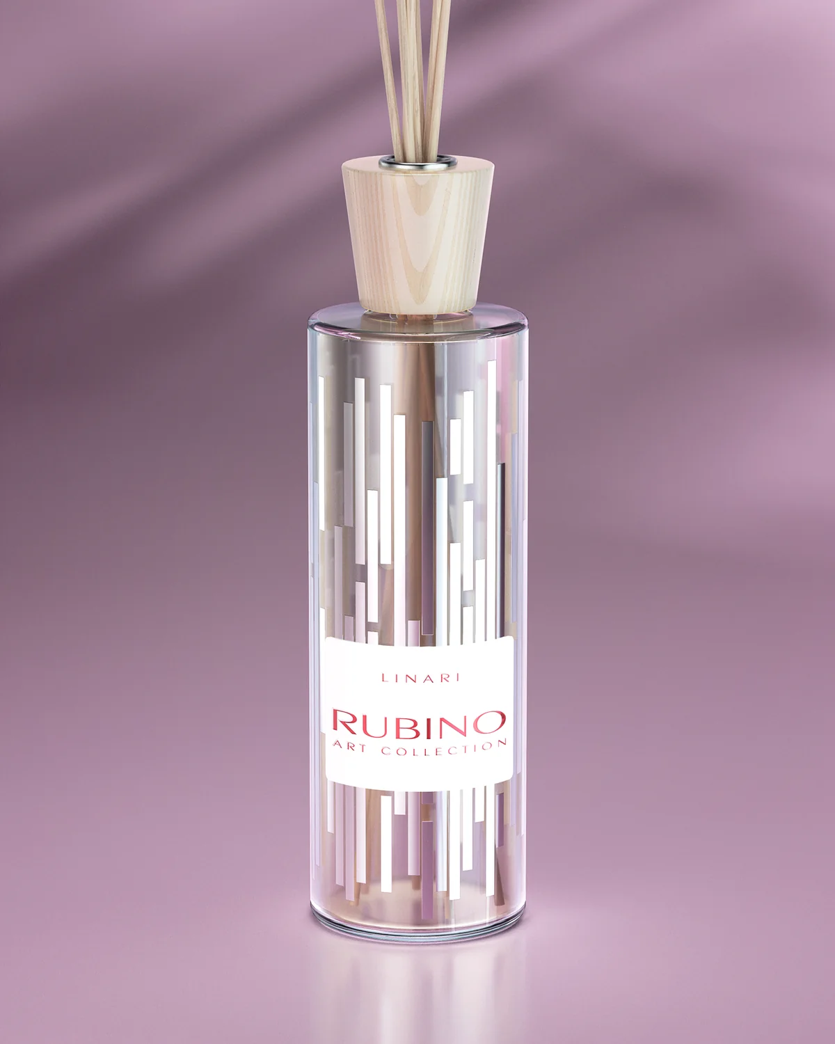
The ART and CRISTALLO ranges stretch this surface-first logic much further. RUBINO ART carries a shiny silver 360-degree skyline treatment that LINARI says is inspired by New York City. Here, graphic decoration wraps around the cylindrical vessel and turns the diffuser into something closer to an illustrated object.
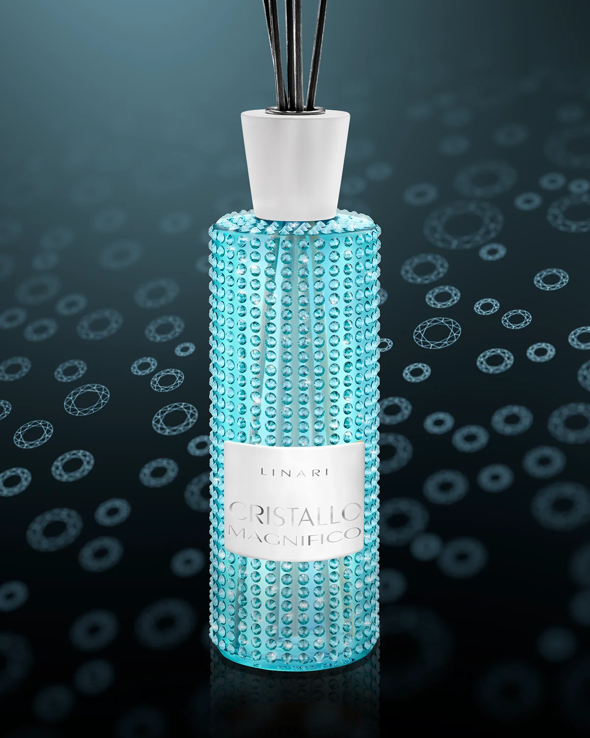
CRISTALLO-MAGNIFICO moves to another level. The official product page states that the aquamarine version is completely covered with 990 individually positioned SWAROVSKI ELEMENTS crystals, paired with a white urea cap and white metal label. LINARI lists that version as a worldwide limited edition of 300 pieces.
Viewed together, OCEANO, SENSO, FENICE, RUBINO ART and CRISTALLO-MAGNIFICO form a useful hierarchy: coloured glass and wood, textile and metal, structured glass, wraparound graphics, then dense applied crystal decoration. The collection demonstrates how far one brand can vary surface investment while preserving a broader object language.
The Perfume Bottles Compress the Same Material Logic
LINARI’s personal fragrances change the proportions but not the interest in material contrast. The current Eau de Parfum assortment includes work by perfumers such as Egon Oelkers, Mark Buxton and Jérôme di Marino, while the bottle family shifts toward a low, wide form.
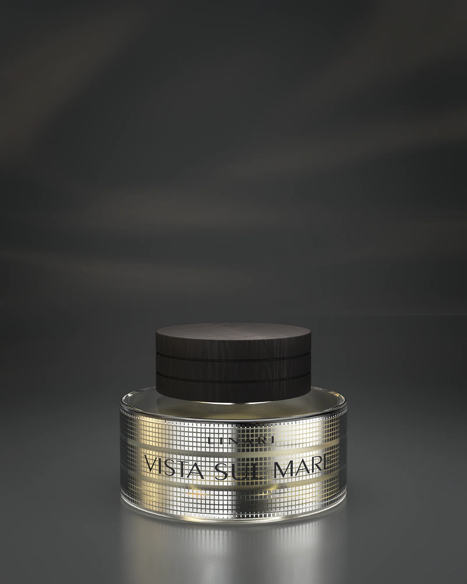
VISTA SUL MARE is a particularly clear example. LINARI specifies heavy French glass surrounded by three wide bands of 21-karat platinum-plated squares, paired with solid wenge above the bottle. PORTA DEL CIELO uses the same broad material vocabulary differently, with a 22-karat gold wave pattern around heavy French glass.
The connection between categories is therefore not a literal reuse of one container. It is a repeated design habit: relatively disciplined geometry provides a base, while material and surface treatment carry much of the individual expression.
LINARI’s Packaging Only Makes Sense Once It Enters the Room
The strongest proof of LINARI’s interior-object logic may be scale. ONICE GRANDEZZA IMPERIALE expands the diffuser to 5000ml. LINARI describes the large bottle as pure aluminium lined with black velvet, with a solid aluminium screw-on cap, brushed label and eight anthracite-black reeds.
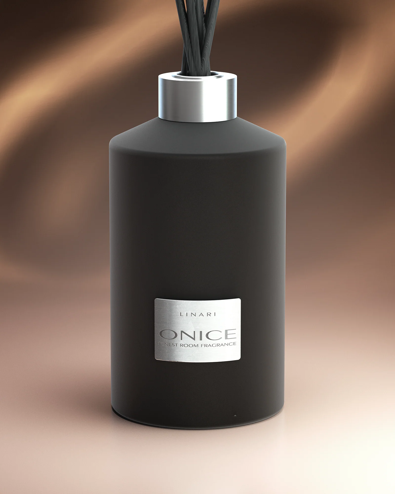
At that size, the relationship between fragrance packaging and room design becomes difficult to ignore. The product occupies physical space, creates a vertical silhouette through its reeds and exposes a large area of surface finish to view and touch.
For fragrance teams developing similarly material-led products, this is also where surface finishing and packaging coordination becomes a practical issue. Coatings, labels, metallic treatments, caps, vessel production and assembly need to resolve as one object rather than as separate decorative decisions.
LINARI’s distinctive strength is therefore not minimalism alone. Its packaging repeatedly uses a restrained form as a platform for changing material experiences. The bottle may begin as a fragrance container, but the brand becomes most legible when that container is allowed to live in the room.