
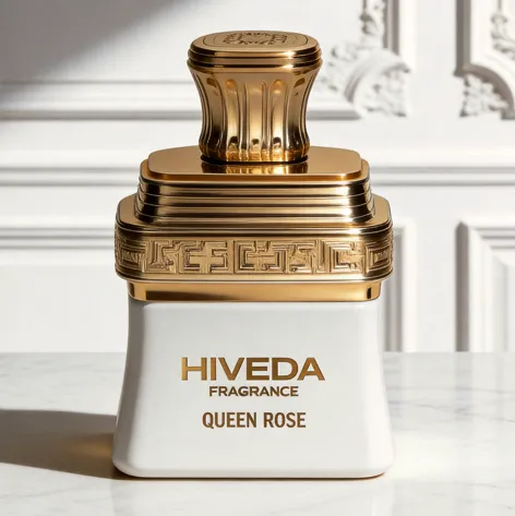
BD-PF-05 is a perfume bottle concept built around contrast: a clean opaque lower body and a highly ornamental gold-finish upper structure. The bottle body is compact, square-based, and softly tapered, while the shoulder, band, and cap carry most of the decorative identity.
This concept could work for a fragrance brand looking for a heritage-inspired, gift-focused, or floral collection direction. The visible “Queen Rose” naming suggests a rose-led concept in the render, but the stronger design logic is structural: the bottle uses a simple body as a base, then lets the gold shoulder system create ceremony, hierarchy, and front-facing recognition.
A Simple Body Controlled by an Ornamental Shoulder
The lower body of BD-PF-05 stays intentionally quiet. It has a short square form, softened lower corners, and slightly tapered sides. This gives the bottle a stable base without making it look like a rigid cube.
That restraint is important because the upper structure is visually active. The gold-finish shoulder includes layered horizontal steps, a decorative relief band, and a raised cap. If the body also carried heavy pattern or complex shape, the full design would become overloaded. Here, the body works as a clean plinth for the ornamental top.
The white version feels the most controlled because the opaque body creates a clear contrast against the gold structure. The gold and lavender variants suggest that the same silhouette could support a collection, but each color would need to keep enough contrast so the shoulder band remains the main design feature.
Why the Gold Band Carries the Identity
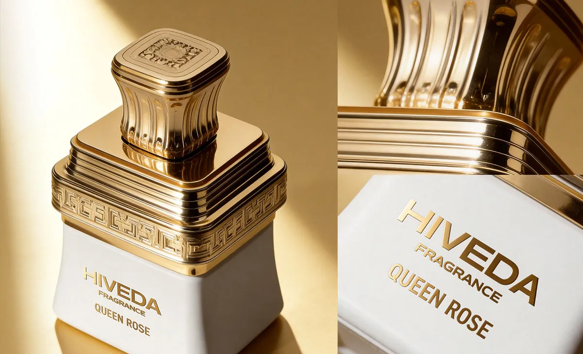
The strongest design element is the gold relief band around the upper body. It acts like a decorative belt between the plain bottle base and the cap. This band gives the bottle a horizontal anchor and makes the product recognizable even before the cap detail is examined closely.
The pattern language appears heritage-inspired, with a repeated geometric relief. This is useful for a concept that wants a formal or ceremonial mood without relying only on printed graphics. The identity is built into the component structure.
From a development point of view, this band would need careful testing. The relief depth, corner continuation, pattern repeat, and surface finish all affect the final look. If the pattern is too shallow, it may disappear under a reflective gold finish. If it is too deep, it may create tooling or finishing challenges around the corners.
Cap Proportion and Relief Detail Need Control
The cap extends the same ornamental language upward. Its rounded-square top relates to the square bottle body, while the fluted side detail adds a column-like rhythm. This makes the cap feel connected to the shoulder band rather than added as a separate accessory.
The cap also gives the user a clear handling point. Because the bottle body is compact, the cap cannot become too tall or too heavy. A small proportion change could make the concept feel top-loaded. Before sampling, the cap height, grip comfort, edge radius, and closure tolerance should be reviewed through 3D modeling and physical prototype checks.
The top surface appears to include an embossed or engraved emblem. This area would need separate decoration review. A top emblem can add value to the handling experience, but it must remain readable after plating, coating, or polishing. The edge of the cap also needs finishing control because users will touch this area repeatedly.
Packaging Should Stay Quiet but Structured
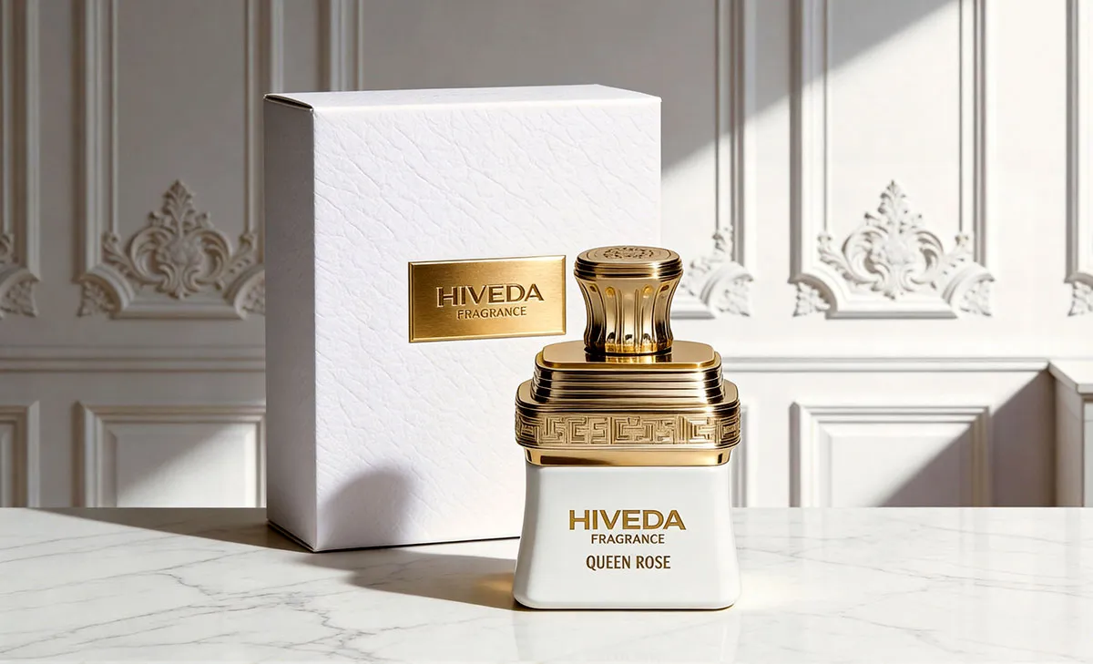
The matching white box supports the bottle by staying quieter than the bottle itself. Its textured surface relates to the white body, while the gold plaque connects to the cap, shoulder band, and front typography. This avoids visual competition.
For this concept, the box should not repeat every ornamental detail from the bottle. The bottle already carries enough relief, layering, and gold surface. The packaging can create value through texture, plaque placement, insert fit, and opening experience instead.
The insert is especially important. The bottle has a broad gold shoulder, raised decorative band, and cap structure that should not rub against the box. A fitted tray should hold the lower body securely while leaving clearance around the ornamental top. For a complete perfume product system, the bottle and box need to be developed together rather than treated as separate design tasks.
From Ornamental Concept to Bespoke Development
BD-PF-05 belongs closer to a bespoke development route because its identity depends on the relationship between body proportion, relief band, cap shape, and packaging structure. This is not only a surface branding exercise.
The first development stage would be 3D modeling to refine the square body, tapered sides, shoulder stack, relief band, and cap proportion. After that, sample planning should focus on how the gold-finish components are produced, assembled, and protected.
- 3D modeling for the square tapered body, shoulder layers, relief band, and cap shape
- Stability review for the compact body and visually heavy upper structure
- Relief pattern testing for depth, corner continuation, and finish clarity
- Cap tolerance, grip comfort, top emblem detail, and closure compatibility checks
- Opaque body color proofing for white, gold, lavender, or other collection directions
- Logo application review on the smooth body surface
- Box texture, gold plaque, insert clearance, filling, assembly, and export-ready packaging review when required
HIVEDA can help move a concept like BD-PF-05 from visual direction into fragrance product development, including bottle design refinement, 3D modeling, 3D printing, mold discussion, cap development, decoration testing, packaging proofing, filling, assembly, and export coordination.
The strength of BD-PF-05 is that it gives ornament a clear job. The lower body stays calm, the gold shoulder creates hierarchy, the cap adds tactile detail, and the packaging frames the set without competing with it. For brands exploring bespoke perfume packaging and bottle development, this concept shows how a simple form can become ceremonial when the upper architecture is developed carefully.
FAQ
Frequently Asked Questions
Have questions about fragrance product development, customization, production, or export? Here are some common answers.
Q1: What is the most important part to test in BD-PF-05?
The gold shoulder band should be tested first. Its relief depth, pattern repeat, corner transition, and surface finish will decide whether the ornamental identity looks sharp or becomes blurred after finishing.
Q2: Could the gold upper structure make the bottle feel too heavy?
Yes. The compact lower body needs enough stability to balance the layered shoulder and cap. During development, cap weight, shoulder thickness, and base stability should be checked together.
Q3: How should the relief pattern around the shoulder be developed?
The pattern should be reviewed in 3D before mold or component development. The key points are whether the relief remains consistent around corners, whether the pattern aligns cleanly, and whether the gold finish keeps the detail readable.
Q4: Why does the lower body stay so simple?
The plain opaque body gives the ornamental top enough space to lead. If the body also used heavy pattern or complex decoration, the bottle could lose visual control and become too busy.
Q5: Can the white, gold, and lavender versions use the same structure?
Yes, the same structure could support a collection, but each body color should be tested with the gold hardware. The contrast between body color, logo, and shoulder band will affect readability and shelf presence.
Q6: What should the packaging protect most carefully?
The insert should protect the gold shoulder band, cap edges, and smooth opaque body surface. These areas are visually important and could show scratches or rubbing if the box fit is not tested properly.