
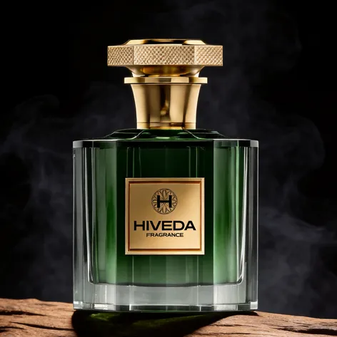
BD-PF-04 is a heavy fluted glass perfume bottle concept built around deep color, thick transparent edges, gold hardware, and a structured presentation box. The visual direction suggests a darker fragrance mood, but the design logic is carried by the bottle itself: rectangular weight, vertical glass rhythm, a textured cap, and a central gold label plate.
This concept could work for a niche fragrance brand, private label collection, or gift-focused perfume line that wants a bottle with more material presence. Instead of using a complex illustration or oversized label, BD-PF-04 uses glass thickness and surface structure to create identity. For brands exploring bespoke perfume bottle design, this is the kind of direction where mold detail, cap finishing, and packaging insert design all matter.
A Heavy Glass Concept for Dark Woody Visual Codes
The first impression of BD-PF-04 comes from its weight. The bottle has a rectangular body, thick clear glass edges, and a heavy transparent base. These elements make the bottle feel grounded, which suits darker visual codes such as wood, smoke, resin, leather, or oud-inspired fragrance directions.
These scent references should be treated as design interpretation, not confirmed formula content. What is visible is a deep green bottle placed against wood and smoke styling. That visual setup gives the concept a natural dark-fragrance mood, while the gold cap and label keep the structure more refined than rustic.
The square front label also plays an important role. A deep green or black bottle can become too visually dense if the branding has no clear frame. The gold plate creates a strong front-facing anchor and connects the bottle body with the metallic cap above it.
Why Fluting Changes the Bottle Surface
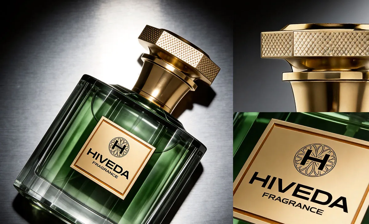
The vertical fluting is the strongest glass detail in BD-PF-04. Without it, the bottle would read as a standard rectangular perfume bottle with a thick base. With it, the surface becomes more architectural. The ribs catch light from different angles and create a subtle rhythm across the front and sides.
This is especially useful for dark glass or deep liquid colors. Dark green, purple, and black tones can absorb light quickly. The fluted structure helps break up the surface so the bottle does not become a flat dark block on shelf. It also gives the user a stronger tactile expectation, even before holding the bottle.
If developed physically, the depth and spacing of the fluting would need careful review. Ribs that are too shallow may disappear after filling. Ribs that are too deep may affect mold complexity, glass clarity, or decoration alignment. The best result would keep the ribs visible while still allowing the front label and liquid color to remain readable.
Gold Hardware as Tactile Control
The cap is not just a color accent. Its wide top, stepped collar, and textured edge give the bottle a controlled handling point. This matters because the body is visually heavy. A small smooth cap would feel weak against the thick glass body, while this broader gold structure gives the upper part enough presence.
The textured cap edge also adds a practical design cue. It suggests grip and touch, which works well with the fluted bottle surface. Both details speak the same language: structured, tactile, and material-led.
The cap finish would need testing during development. Gold surfaces can look different depending on plating, metallization, coating, or plastic-metal finishing routes. For BD-PF-04, the gold tone should match the label plate and box plaque closely enough that the product set feels intentional. Scratch resistance, fingerprints, edge wear, and cap tolerance should all be checked before production direction is confirmed.
Packaging Built Around Protection and Presentation
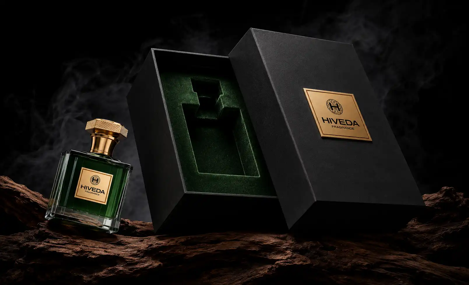
The black presentation box supports the bottle because it extends the dark material mood without copying every bottle detail. The gold plaque on the box connects to the cap and front label, while the deep insert visually echoes the green bottle direction.
For this concept, the packaging should not be treated as a simple outer carton. The bottle has thick glass corners, a raised-looking label area, and a wide cap. A fitted insert is important because it needs to protect the glass body while also allowing the user to remove the bottle without pulling too hard on the cap.
The insert shape would need to be tested around the rectangular body and shoulder area. If the fit is too loose, the bottle may move during transport. If it is too tight, the user may damage the label plate or cap finish while removing it. The opening experience should feel controlled, with the bottle presented upright and easy to lift from the body.
From Fluted Glass Concept to Physical Development
BD-PF-04 belongs closer to a bespoke development route because its identity depends on physical glass structure, not only color or branding. The first stage would be 3D modeling to refine the rectangular body, softened edges, base thickness, rib depth, and cap proportion.
After the form is reviewed, the next step would be sample planning. The fluting, glass wall thickness, base weight, label plate, and cap structure should be checked together. A change in one part can affect the whole product. For example, a heavier cap may require a more stable base, while a thicker label plate may require packaging insert clearance.
- 3D modeling for the rectangular body, softened edges, fluted surface, and base thickness
- Mold evaluation for rib depth, glass clarity, and corner definition
- Color review for deep green, black, and purple body directions
- Gold cap texture, finish, tolerance, and pump compatibility testing
- Label plate material, fixing method, and logo readability review
- Rigid box and insert proofing for protection, removal, and presentation
- Filling, assembly, and export-ready packaging review when required
HIVEDA can help move a concept like BD-PF-04 from visual direction into fragrance product development, including bottle design refinement, 3D modeling, 3D printing, mold discussion, cap and decoration testing, packaging proofing, filling, assembly, and export coordination.
The strength of BD-PF-04 is its material discipline. The thick glass creates weight, the fluting creates light movement, the gold hardware adds tactile control, and the black presentation box frames the product as a complete perfume product system. For a dark woody visual direction, the bottle should stay structured and restrained so the material details do the work.
FAQ
Frequently Asked Questions
Have questions about fragrance product development, customization, production, or export? Here are some common answers.
Q1: What is the most important development point for BD-PF-04?
The most important point is the fluted glass structure. The rib depth, spacing, and edge clarity need to be tested because they control how the bottle catches light and how visible the deep color remains after filling.
Q2: Why does the bottle need a heavy base?
The thick base helps balance the rectangular body and wide gold cap. It also gives the bottle a grounded shelf presence, which supports the darker visual direction better than a light or thin base would.
Q3: Can the fluted surface affect label placement?
Yes. If the label plate sits on or near a ribbed area, alignment and adhesion need careful testing. The front branding zone should be reviewed in 3D to make sure the gold plate stays flat, readable, and visually centered.
Q4: What should be tested on the textured gold cap?
The cap should be tested for grip feel, edge detail, plating or coating consistency, scratch resistance, fingerprint visibility, and compatibility with the pump and collar structure.
Q5: Why is the fitted insert important for this concept?
BD-PF-04 has a heavy glass body, defined corners, a front label plate, and a wide cap. The insert needs to protect all of these areas while still allowing the buyer to remove the bottle smoothly from the box.