
Maison d’Etto is a fragrance house built around horses that rarely needs to show one. Founder Brianna Lipovsky has spent much of her life riding and competing, and the perfumes take their names and emotional briefs from individual horses she has known. Yet the physical identity avoids the easiest signals of equestrian luxury. There is no horse-head bottle, no decorative bit across the front and no need for saddle stitching to explain the concept.
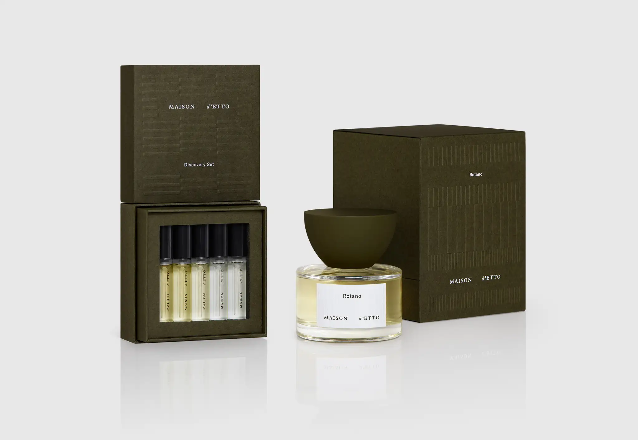
Instead, the New York-founded house translates equestrian experience through architecture, geometry, moss green, tactility and an unusually recognizable dome-like upper form. That distinction is central to Maison d’Etto. The horse supplies the memory and narrative; the package does not have to illustrate it.
The result is a useful case study in how a highly specific founder world can become a brand system without turning into costume. Maison d’Etto’s fragrances may begin with stables, riders, dirt, grass and individual animals, but its visual vocabulary is closer to an interior, a piece of sculpture or an architectural model.
The Horse Is Everywhere – Except on the Bottle
Lipovsky’s equestrian connection is not a marketing layer added after the products were created. She has said that horses have been part of her life since childhood, with much of her time outside work and school spent riding, training and competing. Her professional background, meanwhile, included luxury branding and creative work before she launched Maison d’Etto in 2019.
Those two experiences collide in an unusually controlled way. In a Highsnobiety interview, Lipovsky described trying to bring together horses, fragrance storytelling and brand-building without producing something that felt overly dependent on the established visual codes of equestrian luxury. The publication makes the consequence explicit: Maison d’Etto does not rely on horsebit bottles or saddle-stitched caps. Lipovsky also resisted positioning it simply as a “horsey brand.”
That choice creates a useful separation between source material and visual identity. The fragrances can remain deeply equestrian because each horse functions as a narrative brief rather than a decorative emblem. Rotano can evoke leather, cedarwood and the atmosphere surrounding a stallion; Macanudo can move through grass, hay, earth and the polo field. The bottle does not need to become a horse-shaped summary of either story.
For Maison d’Etto, restraint makes the founder’s world more transferable. Someone with no connection to riding can still approach the object through form, color and scent before learning the personal equestrian narrative underneath it.
An Argentine Stable Becomes a Graphic Language
The clearest bridge between horse culture and packaging is not an animal motif but a building. Studio Lotta Nieminen, which created Maison d’Etto’s visual identity, art direction, packaging and web design, identifies a stable in Argentina as an important source for the identity. The studio describes a place where architecture and nature meet, then shows how that reference is abstracted into geometric patterns rather than reproduced as an illustration.
Rectangular forms create impressions of space and movement. They can run horizontally or vertically, cover a printed surface, appear as a blind emboss or sit over photography. Moss green softens the harder geometry and connects the system visually to nature. The effect is architectural without becoming cold: rigid repetition is balanced by color, paper texture and the irregularity of the images around it.
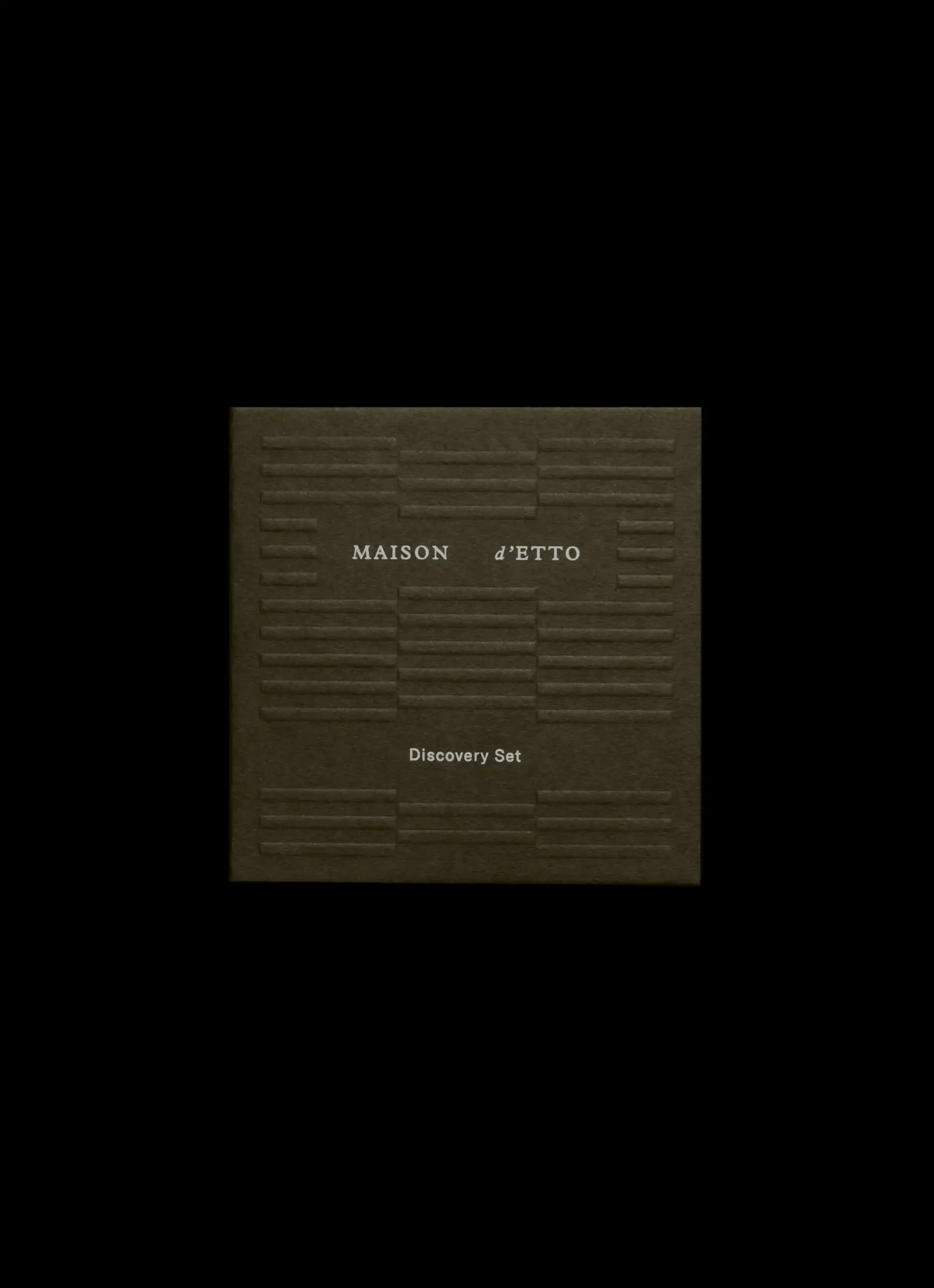
This is more than moodboarding. A literal stable photograph would have limited usefulness once the brand moved from perfume cartons to digital layouts, discovery packaging or textiles. Geometry is more portable. It retains enough of the architectural source to belong to Maison d’Etto while remaining flexible enough to change scale, orientation and application.
For a growing fragrance house, that kind of abstraction is commercially useful. The recognizable element is not tied to one SKU name or one box dimension. It behaves as a system.
The Floating Dome Puts the Signature at the Top
The perfume bottle follows the same logic of controlled distinction. Its main body is relatively restrained: a low circular form with clear glass, a broad base and a white ribbed label. Much of the recognition is concentrated above it. Studio Lotta Nieminen describes the dome-like top element as sculpture-like and appearing to float over the circular bottle.
That upper form changes the hierarchy of the pack. Rather than asking a complicated bottle body to carry every sign of luxury, Maison d’Etto puts much of its silhouette recognition into one prominent zone. The top looks broad in relation to the glass underneath and creates an immediate green horizontal mass above the transparent fragrance.
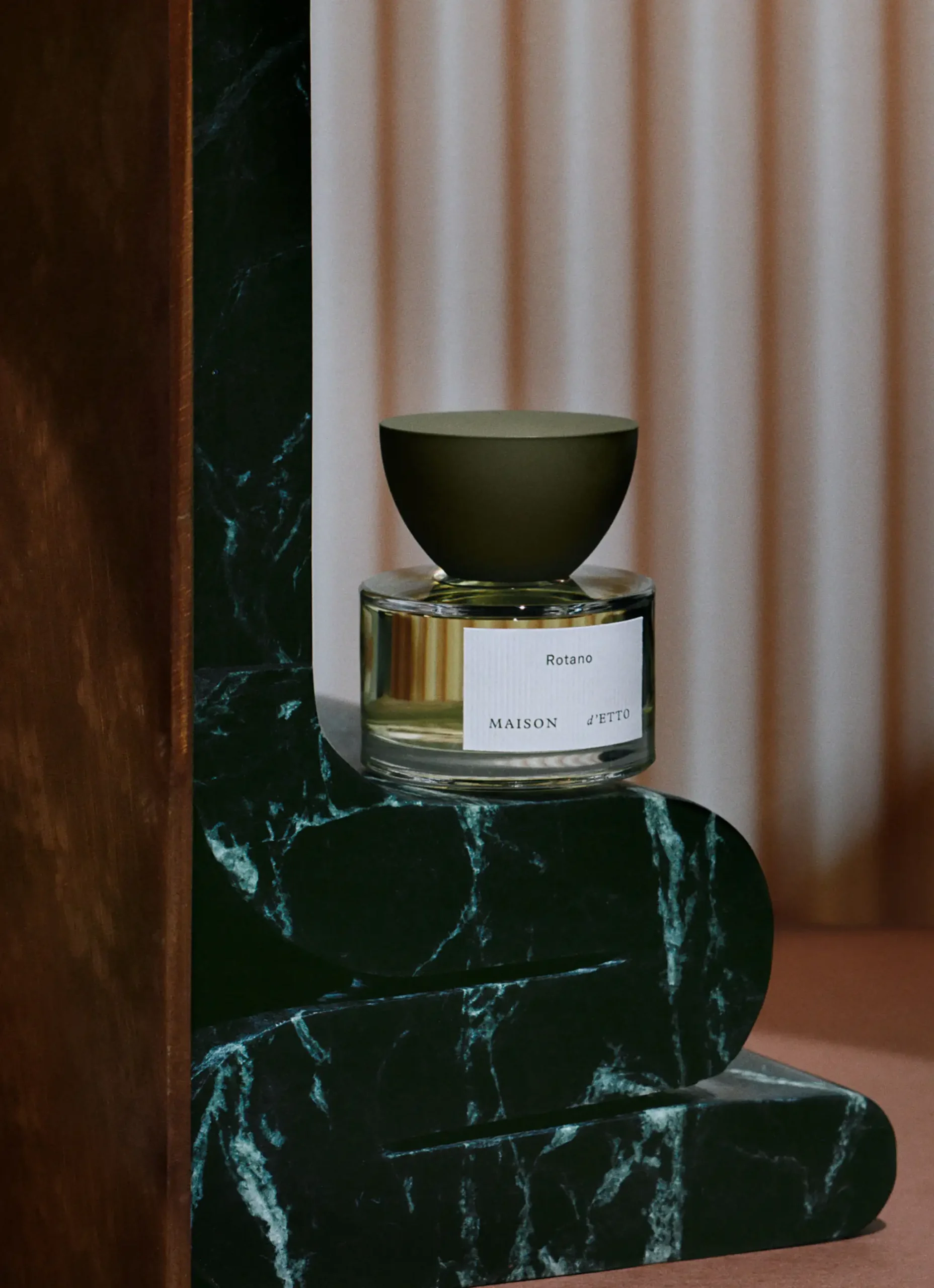
The exact construction, material and manufacturing route of this component are not publicly documented in the sources reviewed here, so its significance is best understood visually rather than technically. What is evident is the division of labor: bottle, label and upper form do not compete at the same intensity.
That is relevant to B2B development because a signature component can become the point around which the rest of a pack is coordinated. For brands pursuing that kind of proprietary physical identity, bespoke perfume packaging development may involve evaluating bottle proportion, cap direction, prototypes, packaging structure and component relationships together. This is an industry parallel only; there is no evidence that HIVEDA manufactures or supplied Maison d’Etto’s packaging.
Maison d’Etto Designed the Box to Outlive the Purchase
Maison d’Etto’s secondary packaging is unusually well documented because both the founder and design studio have explained what the object was expected to do after purchase. Lipovsky has said she wanted the packaging to add aesthetic value to a client’s living environment and to remain practical and portable. Discussing the Discovery Set, she contrasted immediately disposable direct-to-consumer packaging with something made well enough to remain in the home and later hold jewelry, trinkets or crystals.
Studio Lotta Nieminen provides the material and print details behind that idea. The packaging uses Takeo’s Biotope paper stock in a deep moss tone. The studio describes the stock as tactile and matte, with the Maison d’Etto pattern blind embossed into the surface and the logo and other copy hot stamped in white. The box is explicitly described as a keepsake.
This distinction matters when sustainability language becomes vague. Maison d’Etto’s documented brief is not simply “use an eco-looking green box.” It places value on lifespan. A package that remains useful after its first job asks different questions about rigidity, surface durability, opening experience and the relationship between decoration and handling.
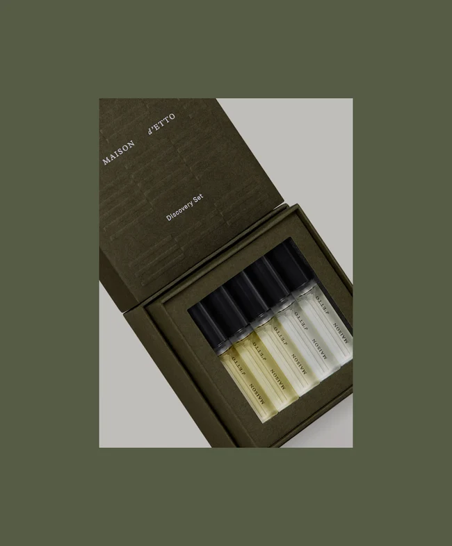
The early Discovery Set also demonstrates how strongly the secondary pack could carry the identity even without a full-size bottle present. Moss green, restrained typography, pattern and orderly internal presentation were enough to make the sampling object feel like part of the same architectural family.
Five Horses Became Eight Without Rebuilding the Bottle
Maison d’Etto began its first collection, “Connection to Self,” around five horses that Lipovsky described as having pivotal effects on her life: Rotano, Karat EG, Durban Jane, Macanudo and Canaan. The current range is larger. Maison d’Etto’s Discovery Set now contains eight fragrances: those original five plus Noisette, Verdades and I—Dream.
The conceptual architecture has expanded too. I—Dream is currently identified as part of Collection III, “Connection to Others,” which Maison d’Etto describes through co-creation, creative relationships and stories that honor connections with others. The subject is therefore no longer confined to one founder-to-horse framework. The larger “connection” idea gives the house room to move between self, others, nature and further relationships without abandoning its founding language.
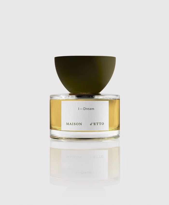
Physically, however, the full-size fragrances remain recognizably Maison d’Etto. I—Dream still works within the same circular bottle family and dominant upper silhouette. The growth strategy therefore does not depend on giving every new conceptual chapter a different flacon.
This is where the packaging system proves its value. Five fragrances can become eight, and the conceptual collections can expand, while recognition remains attached to a limited set of physical cues. SKU differentiation can happen through fragrance name, story, scent and communication without rebuilding the primary package from zero each time.
The Discovery Set Makes Mobility Part of the Luxury
Sampling also fits the founder’s description of the modern equestrian lifestyle. Lipovsky has called that lifestyle extremely nomadic and said portability was considered alongside beauty from the beginning. Riding and competition can involve repeated movement between city, stable, training and events; a compact discovery format makes sense inside that world even when the customer is not an equestrian.
The current Discovery Set contains eight 2.5 ml deluxe sprays and includes a credit toward a full-size 60 ml fragrance. That gives the format two commercial roles. It lowers the barrier to experiencing the complete range at home, and it creates a pathway from sampling to full-size purchase.
There is also a useful tension between the old and new versions of the system. Early official photography still shows the five-fragrance presentation, while the live product now contains eight. That is a small but practical reminder that sampling packaging has to accommodate collection growth. A format that begins as a fixed presentation can become constrained as new SKUs arrive.
For Maison d’Etto, the Discovery Set therefore sits at the intersection of narrative, mobility and assortment planning. It is not merely a miniature version of the perfume bottle. It has to present an expanding library of horse stories coherently while remaining recognizable as a Maison d’Etto object.
When the Stable Pattern Leaves Perfume
The final test of Maison d’Etto’s identity is what happens when the perfume bottle disappears altogether. The current assortment includes 275 g candles in several established fragrance names, including Karat EG, Verdades, Canaan, Rotano, Durban Jane and Macanudo. The brand also sells a Moss Green Stable Scarf, extending the palette and pattern language into textile.
Studio Lotta Nieminen’s original project already anticipated that movement. For the scarf, the geometric pattern became more intricate and expanded across a larger surface to create what the studio describes as an abstracted facade. The scale changes, but the relationship between architecture, moss green and repeated geometry remains recognizable.
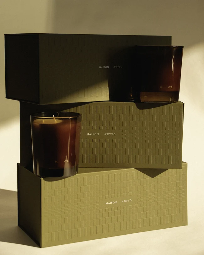
This cross-category movement clarifies what the brand actually owns visually. The dome-like perfume top is memorable, but it is not the entire identity. Moss green, geometric patterning, controlled typography, tactile packaging and an architectural approach to composition can continue without it.
That returns Maison d’Etto to the tension at its beginning. The house is deeply equestrian, but horse imagery is not required to keep proving the point. A real horse can generate the fragrance story; a stable can generate the graphic system; a sculptural top can generate bottle recognition; and the same architectural vocabulary can later move into boxes, candles and silk. The strength of the brand lies in what it translates rather than what it depicts.