
A Dark Bottle Concept Built Around Tactile Glass
BD-PF-09 is a bespoke perfume bottle concept where the identity is carried by surface texture, glass depth, and dark material contrast. The square bottle body gives the concept a stable frame, while the irregular raised texture creates shadow, reflection, and a more tactile front-facing presence.
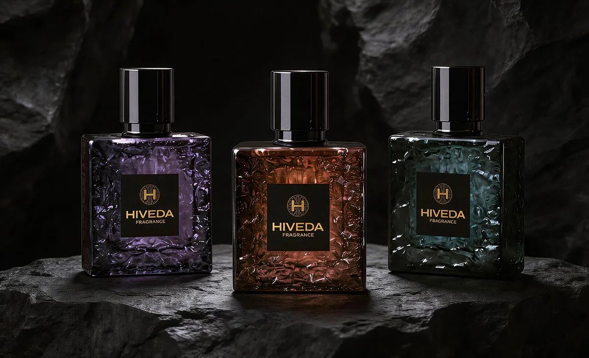
The strength of this direction is that the bottle does not depend only on a label or color coating. The textured surface becomes the main design language. It gives the bottle a mineral-like appearance, especially when shown in smoky amber, purple, and dark green color directions.
This concept could work for a dark niche fragrance, woody amber scent, oud-inspired line, evening fragrance, collector-style perfume, or a private label range that wants a heavier visual identity. It is less suitable for a clean minimal fragrance direction because the bottle surface is intentionally expressive.
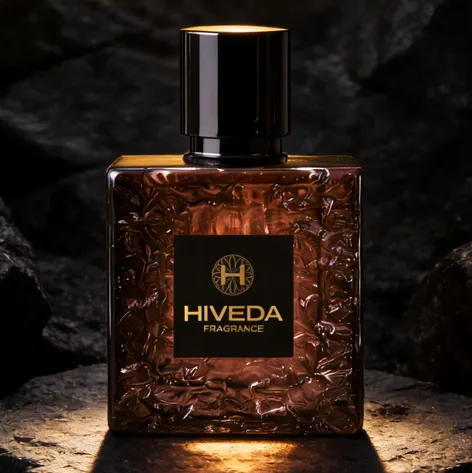
For brands exploring bespoke perfume bottle design, BD-PF-09 shows how texture can become the main brand memory. The form is not complicated, but the surface changes how the bottle reacts to light.
Square Geometry, Relief Texture, and Smoky Color
The square silhouette gives the bottle a strong architectural base. It creates a clear front panel, straight shoulder line, and compact shelf profile. This geometry is important because the raised texture needs a controlled shape around it. Without the square frame, the irregular surface could feel visually uncontrolled.
The relief texture appears concentrated across the front and side areas of the bottle. It creates a fractured, mineral, or carved-glass impression. From a development point of view, this texture would need to be defined carefully: too shallow, and the effect may disappear after coloring; too deep, and it may create mold, glass thickness, or demolding challenges.
The central black label gives the eye a quiet point of focus. It also protects logo readability. Because the surrounding glass has a strong surface pattern, the flat black label panel helps the gold logo and typography remain clear.
The smoky color variants also support the concept. The amber-brown version feels warmer and resin-like, the purple version feels darker and more artistic, and the green-teal version suggests a cooler mineral direction. The shared black cap, square label, and textured body keep the collection visually consistent.
Why the Black Box Should Stay Controlled
The outer box should not compete with the bottle. In the concept images, the black box uses a restrained surface with gold HIVEDA branding. This is the right direction because the bottle already carries a strong tactile pattern.
The box and bottle work as one system through repeated black and gold details. The black cap, black label, black box, and gold logo language create a consistent visual rhythm. The box feels formal, while the bottle feels more sculptural and material-led.
A textured black paper or coated rigid box could support this direction well, but the finishing would need proofing. Gold logo application should be checked for edge sharpness, foil pressure, contrast, and visibility under low light. If the box surface is too rough, fine logo details may lose clarity.
The bottle and box should be developed together. The box needs to protect the raised bottle surface during shipping, but it should also create a controlled reveal when the bottle is opened. A fitted insert would be important for keeping the square bottle stable inside the packaging.
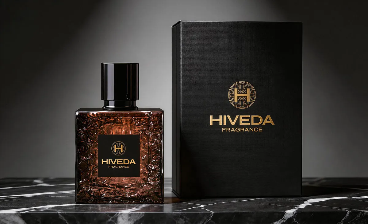
For a fragrance brand comparing bottle and box directions, HIVEDA’s perfume development options can help define how the bottle, cap, decoration, and packaging should be planned as one product set.
What Needs to Be Tested Before Physical Sampling
If BD-PF-09 is developed physically, the first technical question is how the texture should be made. It may be explored as molded glass relief, an applied decorative effect, a surface coating, or another production route. Each route would change the cost, tooling complexity, texture depth, and batch consistency.
For a molded glass route, the development team would need to review relief depth, glass wall thickness, corner radius, base thickness, mold parting, and demolding feasibility. The texture should look irregular, but the production method still needs controlled repeatability.
The flat label area also needs attention. The black square label must sit cleanly on the front surface, so the bottle may need a defined flat panel or a carefully controlled label zone. If the texture comes too close to the label edge, printing or label application could become uneven.
The cap and collar should be reviewed with the bottle neck and pump. The glossy black cap has strong visual weight, so its diameter, height, inner tolerance, and surface finish should be tested against the square bottle proportion.
The packaging should also be tested before production. The box structure, insert fit, gold logo finish, black surface material, and export protection all need proofing. A textured bottle may need more careful internal protection than a smooth bottle because raised surfaces can catch pressure marks during transport.
How HIVEDA Can Support Bespoke Development
For a concept like BD-PF-09, HIVEDA can help move the visual direction into a practical development path. This could begin with bottle proportion review, 3D modeling, texture depth exploration, and sample discussion before moving toward mold evaluation.
HIVEDA can also support color and decoration testing, including tinted glass direction, coating review, logo application, black label placement, and cap surface matching. Because the bottle identity depends heavily on light and texture, sample review would be an important step.
The packaging should be developed alongside the bottle. HIVEDA can support black box structure, insert development, textured paper or coating proofing, gold logo finishing, and packaging protection for export-ready shipping.
Once the concept direction is confirmed, HIVEDA can support a wider development route through fragrance product development services, including sample coordination, filling, assembly, quality control, and export-ready production planning. Brands interested in a similar dark textured bottle direction can contact HIVEDA to discuss structure, surface texture, packaging format, and development feasibility.
FAQ
Frequently Asked Questions
Have questions about fragrance product development, customization, production, or export? Here are some common answers.
Q1: What is the main development challenge for BD-PF-09?
The main challenge is the raised textured bottle surface. Before sampling, the team needs to decide whether the texture should be molded into the glass, applied as a surface decoration, or achieved through another process. This decision affects mold cost, texture depth, glass thickness, and batch consistency.
Q2: Why does the square bottle shape work well with the irregular texture?
The square shape gives the texture a controlled frame. The relief surface looks irregular and mineral-like, but the straight shoulders, flat front, and compact square profile keep the bottle from feeling visually messy. This balance is important for a dark niche fragrance direction.
Q3: What should be checked if the texture is developed as molded glass?
The key checks include relief depth, demolding feasibility, wall thickness, corner radius, base thickness, and whether the texture can be repeated consistently across production batches. The texture should create shadow and depth without making the bottle fragile or difficult to manufacture.
Q4: Why does BD-PF-09 need a flat black label area?
The surrounding glass texture is visually active, so the black label creates a clean reading zone for the gold logo and fragrance name. If the label area is not flat enough, printing, label adhesion, or logo alignment may become uneven.
Q5: What risk comes from using a glossy black cap on this bottle?
The glossy black cap adds strong visual weight at the top, so its height, diameter, and collar fit need to be checked against the square bottle body. If the cap is too tall or too wide, it may overpower the bottle; if it is too small, the dark architectural mood becomes weaker.
Q6: Why should the outer box stay black and restrained?
The bottle already has a strong textured surface, so the box should not add too much competing decoration. A black textured box with gold branding supports the same mood while keeping the presentation controlled and suitable for gifting or retail display.