
A Playful Fragrance Concept With a Clear Visual Hook
BD-PF-08 is a bespoke perfume bottle concept built around contrast. The bottle body is clean, white, and visually steady, while the circular cap feature introduces movement through marbled color, cosmic texture, and a strong front-facing shape.
The strength of this direction is that the product does not rely only on a printed label. The large round element behind the cap becomes the main recognition point. It gives the perfume bottle a graphic silhouette that can be identified quickly in a product grid, retail display, or launch image.
This concept could work for a modern fragrance brand, a youth-facing perfume collection, a limited seasonal launch, or a gift-focused private label range. The “Milky Way” naming direction supports a visual world of color flow, liquid movement, and space-inspired abstraction.
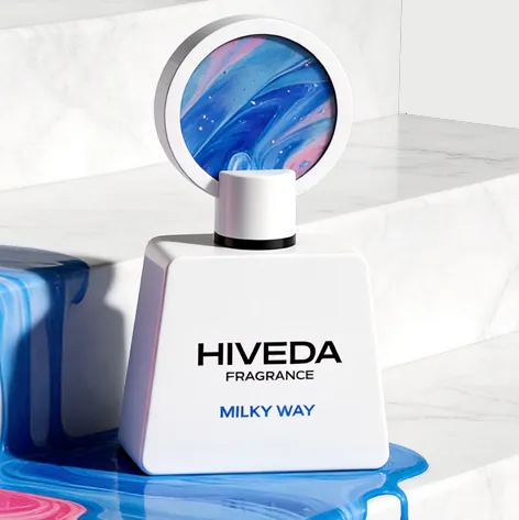
For brands exploring bespoke perfume bottle design, this direction shows how one strong structural detail can define the whole product set. The bottle form stays simple so the cap and packaging can carry the more expressive part of the story.
Why the Bottle Shape Keeps the Concept Grounded
The bottle body uses a low trapezoid silhouette with softened corners and a broad shoulder line. This gives the front profile a stable, grounded feel. Because the base is wider than the neck area, the bottle has visual weight at the bottom, which helps balance the large circular feature above.
The white opaque surface also plays an important role. It reduces visual noise and gives the logo area enough clarity. If the body used the same color intensity as the cap, the whole product could become too busy. Here, the quiet bottle body allows the circular cap insert to become the focus.
The black collar and visible black pump detail create a clean separation between the white bottle and the white overcap. This small dark line is practical from a visual design point of view: it defines the spray area and prevents the upper structure from looking like one flat white block.
The cap does more than finish the bottle. It changes the bottle’s proportion and shelf presence. From the front, the round disc reads almost like a badge, mirror, or small artwork panel. A brand using this design language would need to treat the cap as part of the main identity, not as a secondary accessory.
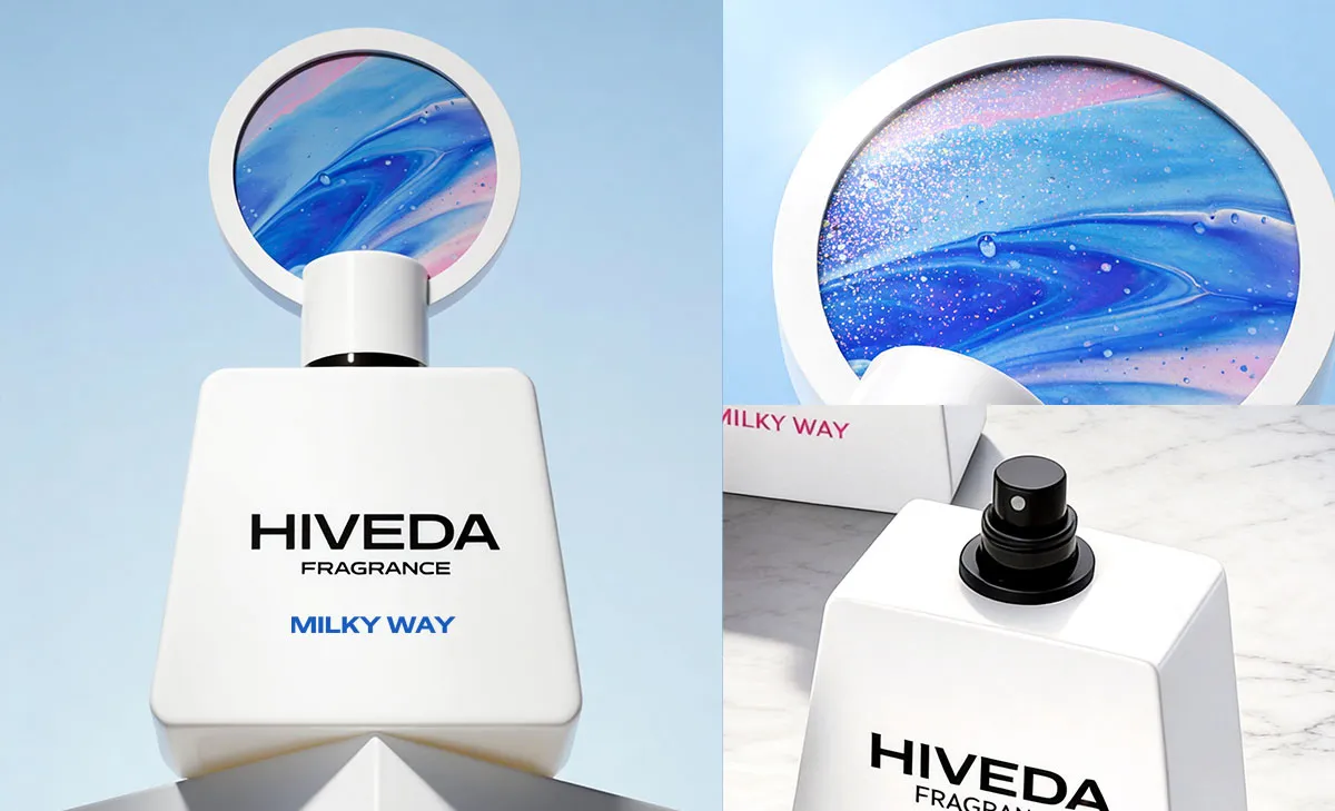
How the Box Extends the Milky Way Direction
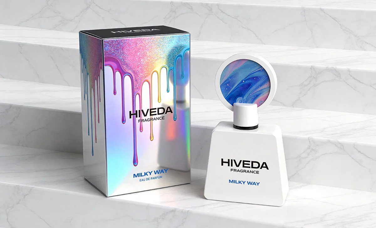
The outer box uses a more expressive surface than the bottle. Its reflective color impression, dripping graphics, and bright gradients extend the Milky Way idea into the packaging system. This is useful because the bottle itself is intentionally restrained.
The box and bottle should be developed as one product set. The bottle gives the concept a clean physical form, while the box adds visual energy and gift impact. Together, they create a clear contrast: calm object, active packaging.
For physical development, the packaging finish would need careful control. A holographic or reflective surface can create strong shelf attention, but it can also reduce logo readability if the artwork is too bright or too reflective. The black HIVEDA logo and blue “Milky Way” name area should remain clear under different lighting conditions.
The dripping graphic direction also connects well with the marbled cap artwork. Instead of repeating the circular cap directly, the box translates the same liquid movement into a larger packaging surface. This makes the box feel related to the bottle without becoming a simple copy of it.
For brands comparing ready structures with more customized development, HIVEDA’s perfume product development pages can help define whether this concept should move through a bespoke route or be adapted from an existing base.
What Needs to Be Tested Before Sampling
If developed physically, BD-PF-08 would need more than visual approval. The first checks should focus on proportion, stability, component fit, and decoration method.
The circular cap structure is the most important development point. Its weight, thickness, attachment method, and tolerance with the pump area would need to be reviewed in 3D. If the disc is too heavy, it could affect handling or assembly. If it is too thin, it may not support the visual impact shown in the concept image.
The bottle body would also need mold evaluation. The sloped sides, shoulder radius, wall thickness, base thickness, and filling capacity should be checked before moving into sample tooling. The soft corners look simple visually, but they still require careful control during glass or molded component development.
The marbled insert could be explored through several decoration routes, depending on cost, order scale, and desired finish. Possible directions include printed insert, coated acrylic insert, resin-effect component, or decorative surface printing. Each route would need sample review because the color flow is central to the concept identity.
For the box, the main checks would include structure proofing, insert fit, artwork alignment, color proofing, lamination or metallic surface testing, and shipping protection. A colorful box can attract attention, but it still needs to protect the bottle and support export-ready packing.
How HIVEDA Can Support This Bespoke Development Route
For a concept like BD-PF-08, HIVEDA can help move the design from visual direction into a practical development path. The process could begin with bottle and cap proportion review, followed by 3D modeling, 3D printing, sample discussion, and mold development evaluation.
HIVEDA can also support the decoration route for the circular cap insert, including printing, coating, color proofing, and component sample review. Because the cap carries the strongest identity, this step should be tested carefully before confirming the final construction.
The packaging should be developed at the same time as the bottle. HIVEDA can support box structure, artwork adaptation, insert development, material proofing, and finishing tests so the outer box protects the bottle and presents the Milky Way concept clearly.
Once the structure and samples are confirmed, HIVEDA can support the wider route through fragrance product development services, including filling, assembly, quality control, and export-ready coordination. For buyers preparing a custom fragrance launch, this helps connect creative direction with the physical requirements of production.
Brands interested in a similar concept can contact HIVEDA to discuss bottle structure, cap direction, packaging format, decoration options, and the most suitable development route for their fragrance project.
FAQ
Frequently Asked Questions
Have questions about fragrance product development, customization, production, or export? Here are some common answers.
Q1: What is the most important development risk for the circular cap detail on BD-PF-08?
The key risk is not only visual proportion, but structure. The circular decorative piece needs to be checked for weight, thickness, attachment strength, and clearance from the spray pump. If it is too heavy or poorly fixed, it may affect handling, assembly, and long-term stability.
Q2: How could the marbled circular insert be produced physically?
Possible routes include printed inserts, acrylic decorative pieces, resin-effect components, coated parts, or laminated graphic panels. Because the blue-pink marbling is the main identity feature, sample testing should focus on color depth, gloss level, edge finishing, and batch consistency.
Q3: Why does the white trapezoid bottle body work with such a strong cap shape?
The white body keeps the lower part of the bottle visually quiet, allowing the circular cap to become the main recognition point. The wide trapezoid base also helps balance the oversized round element above, so the concept feels grounded rather than top-heavy.
Q4: What should be checked before opening a mold for this bottle shape?
The first checks should include bottle capacity, sloped side angles, shoulder radius, base thickness, glass wall thickness, and whether the front logo area stays flat enough for clean printing. Although the body looks simple, the trapezoid proportion and softened corners still need careful mold evaluation.
Q5: Could the reflective Milky Way box affect logo readability?
Yes. The colorful reflective surface supports the Milky Way concept, but it may reduce logo contrast under strong light. Proofing should check whether the black logo, product name, dripping graphics, and background finish remain clear from different viewing angles.