
ANATOLINE is built around a difficult design problem: how do you give many ancient places, belief systems and rituals their own stories without letting the fragrance line fragment into unrelated objects? The Istanbul perfume house answers with repetition. Across much of its range, radically different narratives are carried by a remarkably stable bottle architecture, a recurring seal-like graphic language and a restrained gold-toned visual hierarchy.
That restraint matters because the storytelling itself is abundant. Founder and creative director Halil Özer has described ANATOLINE as the result of long travel, reading and academic research. The brand also says it does not recreate historical perfumes, but reinterprets cultural memory through contemporary fragrances and objects. Packaging becomes the stable frame for stories as different as Mesopotamia, Ephesus, Gobeklitepe and Shaman.
A Film Director Starts with Ruins, Texts and Smell
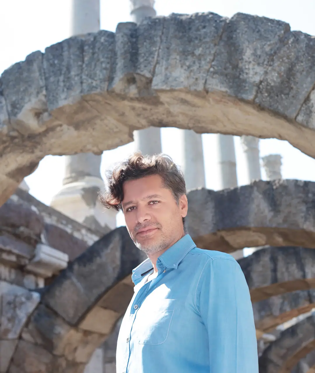
Özer’s route into perfume is unusually useful for understanding ANATOLINE’s product system. In a 2024 Marie Claire Türkiye interview, he identifies himself as a theatre graduate who studied dramatic writing and became an arthouse film director. He also describes ANATOLINE as the outcome of extensive travel, reading and academic research. That background helps explain why the brand’s fragrances are presented as narrative scenes rather than as isolated combinations of notes.
His development account is concrete. When he settles on a subject, Özer says he returns to the relevant city, spends time there, deepens his reading and writes the story before working with the perfumers. He has described the full sequence, including revisions and resting stages, as taking roughly a year. The point is not that every perfume follows a laboratory reconstruction of an ancient formula. ANATOLINE’s own House page explicitly states the opposite: archaeology, cuneiform texts and material culture are sources through which the house reinterprets cultural memory for the present.
That distinction keeps the brand from functioning as a museum replica. Mesopotamia can begin with a black-rose story, Ephesus with an imagined port and perfume shop, and Troia with a besieged-city scene. History provides narrative structure; contemporary perfumery and packaging turn it into a commercial object.
The Hittite Seal Becomes ANATOLINE’s Visual Grammar
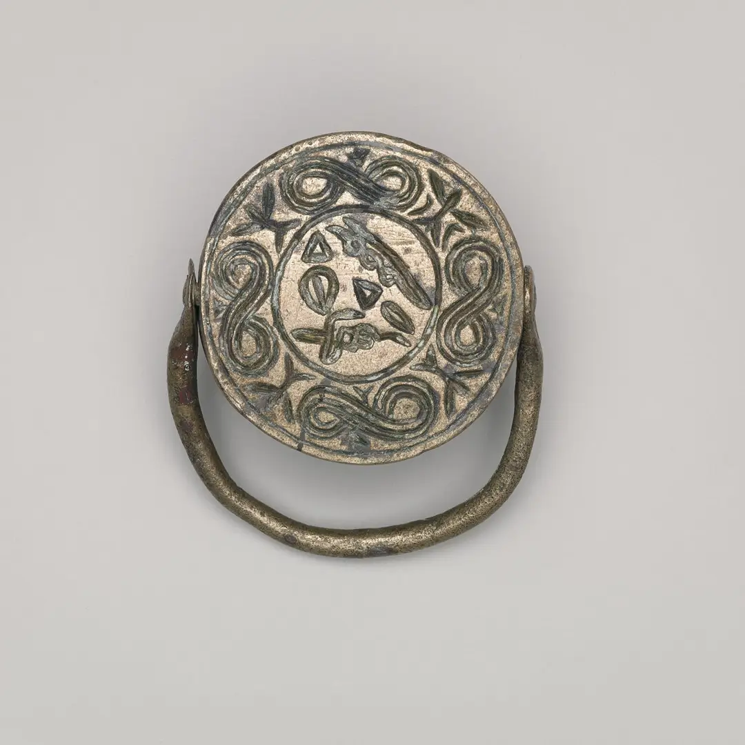
ANATOLINE gives unusually specific evidence for one of its core visual references. On its official House page, the brand says the lines of its perfumes directly resonate with a Hittite emperor’s stamp seal and describes its identity as a contemporary homage to the seal’s eagle and serpent motifs. The page places that statement beside an image of a handled stamp seal dated to the Hittite Empire period.
That source allows a stronger design reading than generic language about “ancient inspiration.” The circular logic of the archaeological object has a visible counterpart in ANATOLINE’s contemporary presentation: a broad disc-like upper element, a centered emblem on the bottle front and repeated circular ornament. The exact engineering, materials and manufacturing process of those components are not publicly confirmed, so the useful observation is formal rather than technical. Circle, seal and emblem recur until they operate as a house code.
This is where the identity becomes commercially interesting. ANATOLINE does not need to illustrate the historical source literally on every SKU; a small group of shapes and symbols can carry recognition through repetition. For a packaging team, heritage can therefore be translated into geometry and hierarchy rather than more decoration. If a recurring physical feature is proprietary, its fit across bottle, top element and outer pack becomes part of the house system.
From Mesopotamia to Gobeklitepe, the Bottle Barely Moves
The clearest packaging mechanism appears when the Antique and Mystic collections are viewed together. Antique currently spans names including Babylon, Ephesus, Hattusha, Ionia, Mesopotamia, Phrygia, Sumerian, Troia and Urartu. Mystic includes Gobeklitepe, Kybele, Shaman, An and Sardis. These subjects range across cities, civilizations, deities and ritual ideas, yet the perfume bottles stay within a narrow visual grammar.
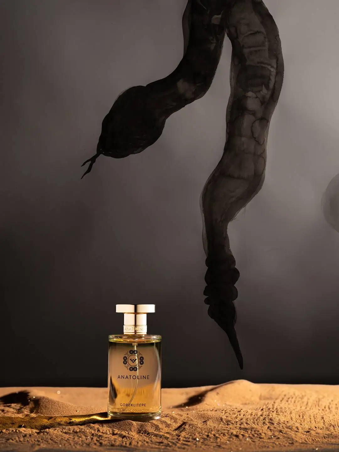
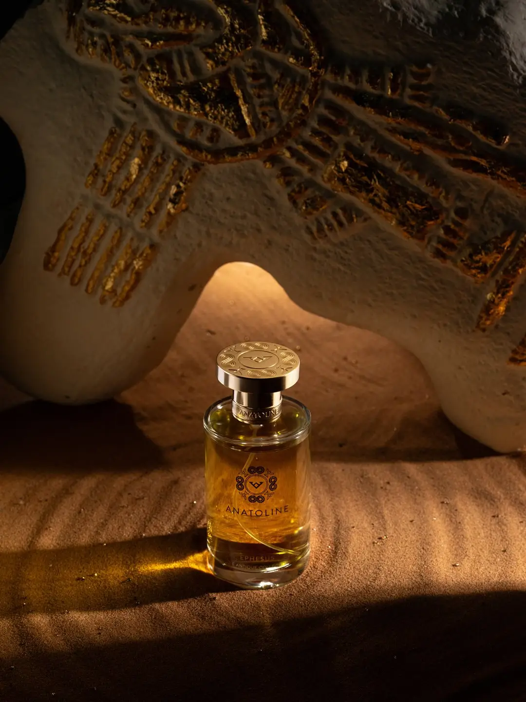
Official imagery repeatedly shows an upright transparent cylindrical body, a substantial clear base, a centered gold-toned emblem and a broad circular upper structure. Fragrance names sit low on the front, while the house mark holds the visual center. The liquid color and surrounding campaign world may change, but the silhouette remains highly recognizable. That creates a productive tension: ANATOLINE’s stories are expansive, while its primary packaging is controlled.
From a product-development perspective, repetition can reduce structural variation across a growing range because every story does not require a new bottle silhouette. Attention shifts toward graphics, finish consistency, component fit, secondary packaging and campaign differentiation rather than a new sculptural bottle for each fragrance.
The Mystic Collection Changes the Subject, Not the House Code
The move from Antique to Mystic expands ANATOLINE’s narrative field without requiring a visual reset. In the Marie Claire interview, Özer describes the first collection through places and civilizations such as Mesopotamia, Ephesus, Urartu and Troia. He describes Mystic as turning toward the beliefs of Anatolian peoples, beginning with Gobeklitepe, Kybele and Shaman. The current Mystic range extends that structure with An and Sardis.
The fragrance descriptions reinforce the shift. Gobeklitepe stages a storyteller among obelisks, with rose, saffron and amber moving through the scene. Shaman moves to Çatalhöyük and a ritual journey shaped by smoke, agarwood, saffron, myrrh and sandalwood. These are not simply new note pyramids with old place names attached. The copy changes the scale of the story from geographic memory toward ritual, deity and altered states.
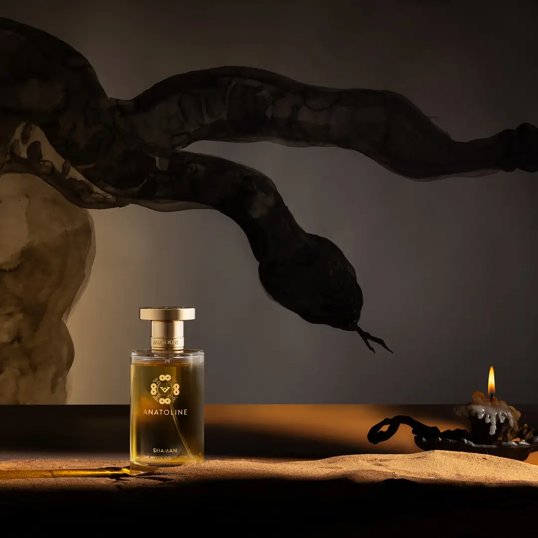
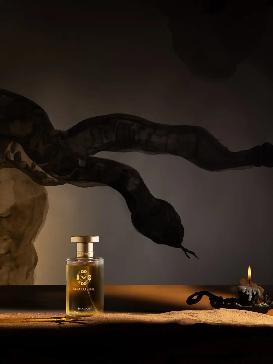
Yet Mystic does not need a new bottle family to announce that change. Campaign imagery can carry more narrative work. The darker Shaman visual places the familiar bottle among fire-lit and serpent-like forms. The division is clear: the pack holds recognition while art direction carries more of the SKU-specific drama.
Black Packaging Gives the Stories a Second Stage
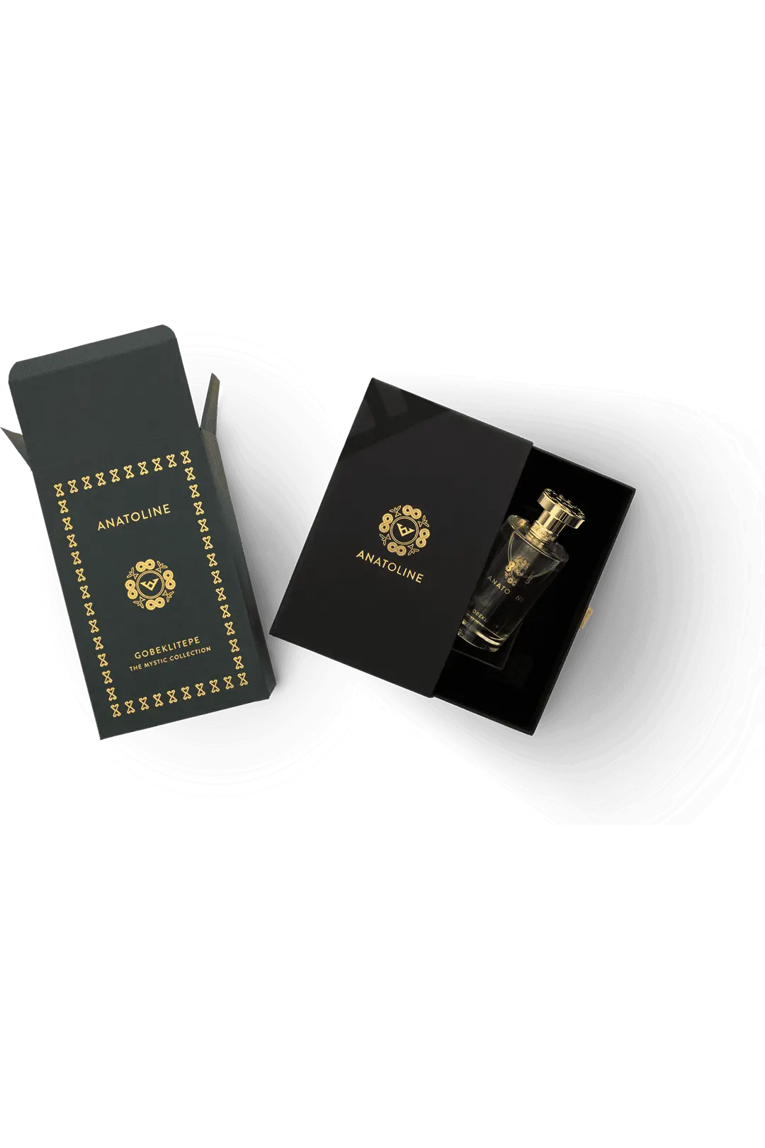
The secondary packaging gives ANATOLINE another surface on which to increase narrative density. Official Gobeklitepe imagery shows a dark presentation box with gold-toned insignia, borders and ornament, while the bottle sits within a fitted interior presentation. Visually, the contrast is clear: the bottle body remains transparent and relatively restrained, while the outer presentation becomes darker, more enclosed and more ceremonial.
That hierarchy avoids repeating the same amount of ornament on every component. The bottle carries the emblem, name and repeated upper structure; the larger dark field of the box gives the gold-toned graphic system more room. The result is controlled distribution of visual information rather than strict minimalism.
For B2B teams, the packaging implication is coordination. Once bottle, top element, central graphic, insert and box all contribute to one repeated house code, consistency across those interfaces becomes more important than any single decorative flourish. Alignment, print placement, fit and the relationship between primary and secondary packaging have to be reviewed as a system. That is the same kind of cross-component problem addressed in fragrance packaging and production coordination, although there is no evidence that HIVEDA has any manufacturing relationship with ANATOLINE.
The Temple Collection Takes the Archaeological Language Home
ANATOLINE’s current site now places a third category beside Antique and Mystic: The Temple Collection. The brand describes it through terracotta vessels, sacred flames and ancient olfactory rituals, and its current shop includes Ephesus and Troia candles. That matters because the house identity is beginning to operate beyond a perfume bottle.
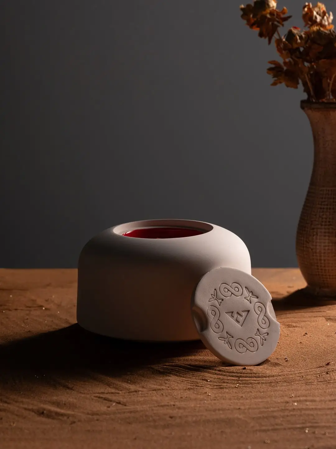
The visible Temple imagery does not simply shrink the fragrance bottle into a candle format. A pale, rounded vessel introduces a different physical silhouette, while circular ornament and seal-like detailing preserve a family resemblance. From an editorial perspective, this is a more demanding test of the brand system. If recognition depended only on one cylindrical perfume bottle, expansion into home fragrance could weaken it. By carrying selected motifs rather than copying the entire object, ANATOLINE can extend the archaeological language across categories.
Cross-category identity requires deciding which elements are structural and which are portable. A bottle silhouette may not translate to a candle vessel, but typography, emblem scale, border logic, color relationships or a recurring top-detail motif can. The Temple direction suggests that ANATOLINE’s strongest visual equity is broader than the perfume flacon itself.
ANATOLINE Wants Its History Read Slowly
The final piece of the system is pace. Özer has said that ANATOLINE prefers places where interested customers can smell for a long time without being disturbed and where the brand’s stories can be heard comfortably. That preference fits the product itself. A bottle whose architecture changes little from one SKU to another does not compete for attention through novelty alone; it asks the customer to move closer, read the name, hear the narrative and smell the difference.
The brand’s current digital behavior supports the same reading. Alongside its three collections, ANATOLINE continues to publish long historical stories, including recent pieces on Troia, Urartu, Ephesus and Mesopotamia. The content is not detached from the products. It expands the cultural world that the packaging can only signal in compressed form.
That is why the Hittite seal matters so much. It gives ANATOLINE a compact visual device capable of holding an unusually large amount of narrative variation together. The strongest lesson is not that every heritage brand needs an archaeological symbol. It is that a deep story becomes easier to scale when the physical identity knows what to repeat. In ANATOLINE’s case, the seal, circular geometry, restrained bottle and darker presentation system create the stable frame; the civilizations, rituals and scents are free to change inside it.